---
title: "ggplot US state and China province heatmap"
author: "Yang Liu"
date: "2020-06-12"
description: "R examples for drawing US state and China province heatmaps with ggplot2, usmap, shapefiles, labels, scale bars, and leaflet-based alternatives."
categories:
- "Data Visualization"
tags:
- "Heatmap"
- "Geodata"
page-layout: article
execute:
freeze: true
eval: false
resources:
- "source.Rmd"
- "index_files/**"
- "images/**"
- "temp/**"
- "2019-04-17-ggplot-heatmap-us-50-states-map-and-china-province-map_files/**"
- "*.png"
- "*.jpg"
- "*.jpeg"
- "*.JPG"
- "*.PNG"
- "*.gif"
- "*.svg"
- "*.rds"
- "*.csv"
- "*.xlsx"
---
<link href="/rmarkdown-libs/pagedtable/css/pagedtable.css" rel="stylesheet" />
<script src="/rmarkdown-libs/pagedtable/js/pagedtable.js"></script>
<script src="/rmarkdown-libs/htmlwidgets/htmlwidgets.js"></script>
<script src="/rmarkdown-libs/jquery/jquery.min.js"></script>
<link href="/rmarkdown-libs/leaflet/leaflet.css" rel="stylesheet" />
<script src="/rmarkdown-libs/leaflet/leaflet.js"></script>
<link href="/rmarkdown-libs/leafletfix/leafletfix.css" rel="stylesheet" />
<script src="/rmarkdown-libs/proj4/proj4.min.js"></script>
<script src="/rmarkdown-libs/Proj4Leaflet/proj4leaflet.js"></script>
<link href="/rmarkdown-libs/rstudio_leaflet/rstudio_leaflet.css" rel="stylesheet" />
<script src="/rmarkdown-libs/leaflet-binding/leaflet.js"></script>
<div id="TOC">
<ul>
<li><a href="#us-map-by-state" id="toc-us-map-by-state">1. US Map by state</a>
<ul>
<li><a href="#method-1.-use-usmap" id="toc-method-1.-use-usmap">Method 1. Use <code>usmap</code></a></li>
<li><a href="#method-2.-use-map_data-and-build-from-shape-files" id="toc-method-2.-use-map_data-and-build-from-shape-files">Method 2. Use <code>map_data</code> and build from shape files</a></li>
</ul></li>
<li><a href="#china-map-by-province" id="toc-china-map-by-province">2. China map by province</a>
<ul>
<li><a href="#method-1.-china-map-by-province-using-downloaded-shap-files" id="toc-method-1.-china-map-by-province-using-downloaded-shap-files">Method 1. China map by province using downloaded shapefiles</a></li>
<li><a href="#method-2.-using-geojsonmap-leaflet" id="toc-method-2.-using-geojsonmap-leaflet">Method 2. Using geojsonMap (leaflet)</a></li>
</ul></li>
</ul>
</div>
<p><strong>Updated on 2020-06-12; first posted on 2019-04-17.</strong></p>
<p>This post collects a few R approaches for drawing state- and province-level thematic maps. The goal is to keep the examples practical: labels, scale bars, color fills, and enough flexibility to adjust the final plot.</p>
<p>I will show:</p>
<ol style="list-style-type: decimal">
<li><p>50-state (including Alaska and Hawaii) United States thematic map, with map scale and with state abbreviations</p></li>
<li><p>China thematic map, with map scale and province names in either English or Chinese</p></li>
</ol>
<div id="us-map-by-state" class="section level1">
<h1>1. US Map by state</h1>
<p>The <code>dt1</code> below can be used by both methods. With <code>usmap</code>, only two variables are needed: state names and the value to plot.</p>
<pre class="r"><code>suppressPackageStartupMessages({
library(ggplot2)
library(maps)
library(usmap)
library(rgeos) # for rgeos::gCentroid
library(data.table)
library(ggsn) # for adding map scale bar `ggsn::scalebar`
library(shadowtext) # for adding label
library(ggrepel) # if need to repel labels
})
# A sample dataset of 77 states:
dt1 <- as.data.table(copy(state.x77))
dt1$state <- tolower(rownames(state.x77))
dt1 <- dt1[,.(state, Population)]
setkey(dt1, state)
states <- setDT(ggplot2::map_data("state"))
setkey(states, region)
# join data to map: left join states to dt1
dt1 <- dt1[states]
#
rmarkdown::paged_table(dt1[1:50,])</code></pre>
<div data-pagedtable="false">
<script data-pagedtable-source type="application/json">
{"columns":[{"label":["state"],"name":[1],"type":["chr"],"align":["left"]},{"label":["Population"],"name":[2],"type":["dbl"],"align":["right"]},{"label":["long"],"name":[3],"type":["dbl"],"align":["right"]},{"label":["lat"],"name":[4],"type":["dbl"],"align":["right"]},{"label":["group"],"name":[5],"type":["dbl"],"align":["right"]},{"label":["order"],"name":[6],"type":["int"],"align":["right"]},{"label":["subregion"],"name":[7],"type":["chr"],"align":["left"]}],"data":[{"1":"alabama","2":"3615","3":"-87.46201","4":"30.38968","5":"1","6":"1","7":"NA"},{"1":"alabama","2":"3615","3":"-87.48493","4":"30.37249","5":"1","6":"2","7":"NA"},{"1":"alabama","2":"3615","3":"-87.52503","4":"30.37249","5":"1","6":"3","7":"NA"},{"1":"alabama","2":"3615","3":"-87.53076","4":"30.33239","5":"1","6":"4","7":"NA"},{"1":"alabama","2":"3615","3":"-87.57087","4":"30.32665","5":"1","6":"5","7":"NA"},{"1":"alabama","2":"3615","3":"-87.58806","4":"30.32665","5":"1","6":"6","7":"NA"},{"1":"alabama","2":"3615","3":"-87.59379","4":"30.30947","5":"1","6":"7","7":"NA"},{"1":"alabama","2":"3615","3":"-87.59379","4":"30.28655","5":"1","6":"8","7":"NA"},{"1":"alabama","2":"3615","3":"-87.67400","4":"30.27509","5":"1","6":"9","7":"NA"},{"1":"alabama","2":"3615","3":"-87.81152","4":"30.25790","5":"1","6":"10","7":"NA"},{"1":"alabama","2":"3615","3":"-87.88026","4":"30.24644","5":"1","6":"11","7":"NA"},{"1":"alabama","2":"3615","3":"-87.92037","4":"30.24644","5":"1","6":"12","7":"NA"},{"1":"alabama","2":"3615","3":"-87.95475","4":"30.24644","5":"1","6":"13","7":"NA"},{"1":"alabama","2":"3615","3":"-88.00632","4":"30.24071","5":"1","6":"14","7":"NA"},{"1":"alabama","2":"3615","3":"-88.01778","4":"30.25217","5":"1","6":"15","7":"NA"},{"1":"alabama","2":"3615","3":"-88.01205","4":"30.26936","5":"1","6":"16","7":"NA"},{"1":"alabama","2":"3615","3":"-87.99486","4":"30.27509","5":"1","6":"17","7":"NA"},{"1":"alabama","2":"3615","3":"-87.95475","4":"30.27509","5":"1","6":"18","7":"NA"},{"1":"alabama","2":"3615","3":"-87.90318","4":"30.28082","5":"1","6":"19","7":"NA"},{"1":"alabama","2":"3615","3":"-87.82870","4":"30.28655","5":"1","6":"20","7":"NA"},{"1":"alabama","2":"3615","3":"-87.80006","4":"30.28655","5":"1","6":"21","7":"NA"},{"1":"alabama","2":"3615","3":"-87.80006","4":"30.32665","5":"1","6":"22","7":"NA"},{"1":"alabama","2":"3615","3":"-87.81724","4":"30.34385","5":"1","6":"23","7":"NA"},{"1":"alabama","2":"3615","3":"-87.84016","4":"30.38395","5":"1","6":"24","7":"NA"},{"1":"alabama","2":"3615","3":"-87.85162","4":"30.40114","5":"1","6":"25","7":"NA"},{"1":"alabama","2":"3615","3":"-87.87453","4":"30.41260","5":"1","6":"26","7":"NA"},{"1":"alabama","2":"3615","3":"-87.90318","4":"30.42406","5":"1","6":"27","7":"NA"},{"1":"alabama","2":"3615","3":"-87.92610","4":"30.44698","5":"1","6":"28","7":"NA"},{"1":"alabama","2":"3615","3":"-87.93183","4":"30.49281","5":"1","6":"29","7":"NA"},{"1":"alabama","2":"3615","3":"-87.94329","4":"30.52719","5":"1","6":"30","7":"NA"},{"1":"alabama","2":"3615","3":"-87.92037","4":"30.56157","5":"1","6":"31","7":"NA"},{"1":"alabama","2":"3615","3":"-87.91464","4":"30.58449","5":"1","6":"32","7":"NA"},{"1":"alabama","2":"3615","3":"-87.92610","4":"30.61886","5":"1","6":"33","7":"NA"},{"1":"alabama","2":"3615","3":"-87.92037","4":"30.67043","5":"1","6":"34","7":"NA"},{"1":"alabama","2":"3615","3":"-87.94902","4":"30.69908","5":"1","6":"35","7":"NA"},{"1":"alabama","2":"3615","3":"-87.98913","4":"30.79075","5":"1","6":"36","7":"NA"},{"1":"alabama","2":"3615","3":"-88.00632","4":"30.79648","5":"1","6":"37","7":"NA"},{"1":"alabama","2":"3615","3":"-88.01778","4":"30.80221","5":"1","6":"38","7":"NA"},{"1":"alabama","2":"3615","3":"-88.03497","4":"30.79075","5":"1","6":"39","7":"NA"},{"1":"alabama","2":"3615","3":"-88.04642","4":"30.75638","5":"1","6":"40","7":"NA"},{"1":"alabama","2":"3615","3":"-88.05215","4":"30.72773","5":"1","6":"41","7":"NA"},{"1":"alabama","2":"3615","3":"-88.05215","4":"30.71054","5":"1","6":"42","7":"NA"},{"1":"alabama","2":"3615","3":"-88.06361","4":"30.68762","5":"1","6":"43","7":"NA"},{"1":"alabama","2":"3615","3":"-88.06934","4":"30.68189","5":"1","6":"44","7":"NA"},{"1":"alabama","2":"3615","3":"-88.08080","4":"30.63033","5":"1","6":"45","7":"NA"},{"1":"alabama","2":"3615","3":"-88.08080","4":"30.61314","5":"1","6":"46","7":"NA"},{"1":"alabama","2":"3615","3":"-88.09799","4":"30.60741","5":"1","6":"47","7":"NA"},{"1":"alabama","2":"3615","3":"-88.10944","4":"30.59595","5":"1","6":"48","7":"NA"},{"1":"alabama","2":"3615","3":"-88.11518","4":"30.58449","5":"1","6":"49","7":"NA"},{"1":"alabama","2":"3615","3":"-88.10944","4":"30.55584","5":"1","6":"50","7":"NA"}],"options":{"columns":{"min":{},"max":[10]},"rows":{"min":[10],"max":[10]},"pages":{}}}
</script>
</div>
<div id="method-1.-use-usmap" class="section level2">
<h2>Method 1. Use <code>usmap</code></h2>
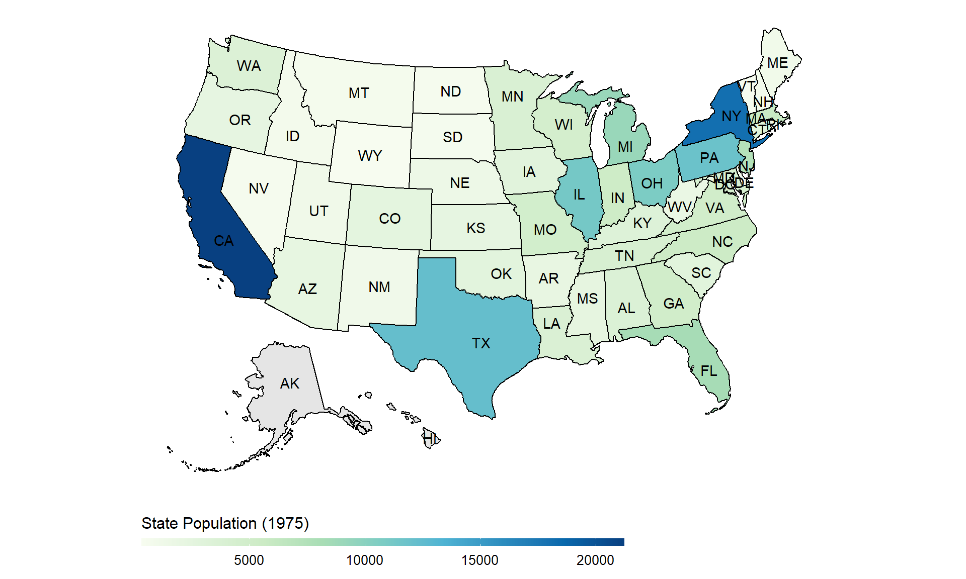
<p>The easiest way is to use the <code>usmap</code> package. State abbreviations can be added directly with <code>usmap::plot_usmap</code>. This is easy to start with, though harder to fine-tune in detail.</p>
<pre class="r"><code>dt1_simple <- unique(dt1[,.(state, Population)])
usmap::plot_usmap(data = dt1_simple, values = "Population", labels = TRUE) +
labs(fill = 'State Population (1975)') +
scale_fill_gradientn(colours = RColorBrewer::brewer.pal(9, "GnBu"),
na.value = "grey90",
guide = guide_colourbar(barwidth = 25,
barheight = 0.4,
#put legend title on top of legend
title.position = "top")) +
# put legend at the bottom, adjust legend title and text font sizes
theme(legend.position = "bottom",
legend.title=element_text(size=12),
legend.text=element_text(size=10))</code></pre>
<p><img src="2019-04-17-ggplot-heatmap-us-50-states-map-and-china-province-map_files/figure-html/unnamed-chunk-2-1.png" width="960" /></p>
<p>The <code>plot_usmap</code> returns a ggplot object so it is possible to further revise by just adding more layers.</p>
</div>
<div id="method-2.-use-map_data-and-build-from-shape-files" class="section level2">
<h2>Method 2. Use <code>map_data</code> and build from shape files</h2>
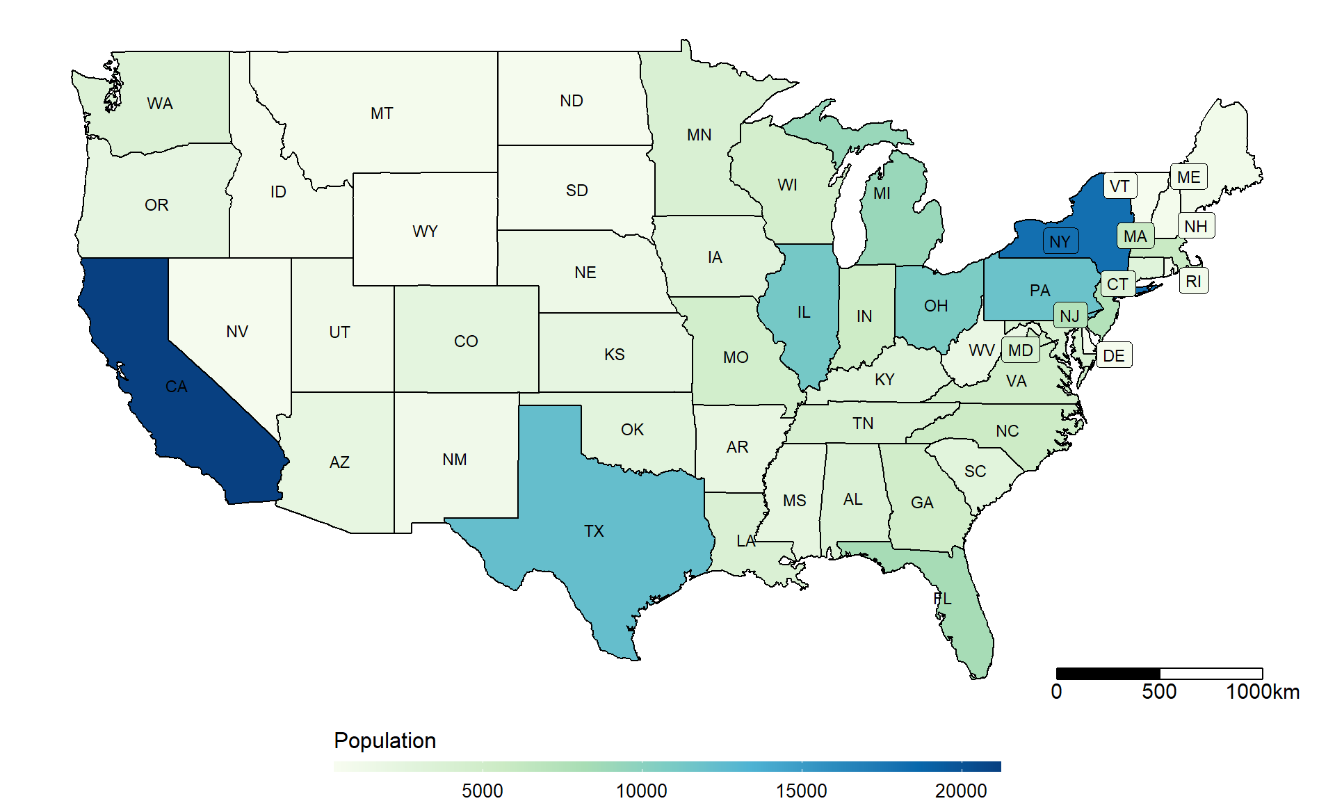
<p>This approach makes it possible to fine-tune label locations, as in the China map later. Here the label is placed near the center of each state: <code>mean(lon), min(lat)</code>.</p>
<pre class="r"><code># create labels
# incl `Population` (the value to plot) in the label dataset, if want to fill with color.
#' get centroids from a shp file dataset
get.centroids <- function(
data = dt1,
long = "long", lat = "lat",
by_var = "state", # the grouping variable, e.g. state: get centroid by state
fill_var = NULL # the variable to plot
){
data <- data[!is.na(data[[by_var]]),]
data[[by_var]] <- as.character(data[[by_var]]) # sometimes there is empty factor level
dt1_df <- sp::SpatialPointsDataFrame(coords = data[, c(long, lat), with = FALSE], data = data)
dt1_geo <- by(dt1_df, dt1_df[[by_var]], function(x) {sp::Polygon(x[c(long, lat)])@labpt})
centroids <- stats::setNames(do.call("rbind.data.frame", dt1_geo), c(long, lat))
centroids$name <- names(dt1_geo)
if(!is.null(fill_var)){ # if need to join fill value
setkeyv(setDT(centroids), "name")
dt_var <- unique(data[,c(by_var, fill_var), with = FALSE])
setkeyv(dt_var, by_var)
centroids <- dt_var[centroids]
}
return(centroids)
}
centroids <- get.centroids(data = dt1, long = "long", lat = "lat", by_var = "state", fill_var = "Population")
# join short state names (e.g. VA, SC)
abb_names <- data.table(state = tolower(state.name), abb = state.abb) # these are R dataset
setkey(setDT(centroids), state)
setkey(abb_names, state)
centroids <- abb_names[centroids]
head(centroids, 3)</code></pre>
<pre><code>## state abb Population long lat
## 1: alabama AL 3615 -86.83042 32.80316
## 2: arizona AZ 2212 -111.66786 34.30060
## 3: arkansas AR 2110 -92.44013 34.90418</code></pre>
<pre class="r"><code>x_boundary = -77
ggplot(data = dt1, aes(x = long, y = lat, group = group))+
geom_polygon(aes(fill = Population))+
geom_path()+
scale_fill_gradientn(colours = RColorBrewer::brewer.pal(9, "GnBu"),
na.value = "grey90",
guide = guide_colourbar(barwidth = 25, barheight = 0.4,
#put legend title on top of legend
title.position = "top")) +
# shadowtext::geom_shadowtext(data = centroids,
# aes(x = long, y = lat, label = abb),
# size = 3,
# inherit.aes = FALSE) +
# if need to repel labels... could further fine-tune
ggrepel::geom_label_repel(data = centroids[long >= x_boundary,],
aes(x = long, y = lat, label = abb, fill = Population),
force = 1, size = 3,
inherit.aes = F
) +
# the normal labels:
geom_text(data=centroids[long < x_boundary,],
aes(x = long, y = lat, label = abb),
size = 3, inherit.aes=F) +
labs(fill = "Population", x = "Longitude", y = "Latitude") +
coord_map() +
# map scale
ggsn::scalebar(data = dt1, dist = 500, dist_unit = "km",
border.size = 0.4, st.size = 4,
box.fill = c('black','white'),
transform = TRUE, model = "WGS84") +
theme_void() +
# put legend at the bottom, adjust legend title and text font sizes
theme(legend.position = "bottom",
legend.title=element_text(size=12), # font size of the legend
legend.text=element_text(size=10))</code></pre>
<p><img src="2019-04-17-ggplot-heatmap-us-50-states-map-and-china-province-map_files/figure-html/unnamed-chunk-3-1.png" width="960" /></p>
<pre class="r"><code>#
# ggsave("us_example.png", width = 10, height = 6)</code></pre>
</div>
</div>
<div id="china-map-by-province" class="section level1">
<h1>2. China map by province</h1>
<div id="method-1.-china-map-by-province-using-downloaded-shap-files" class="section level2">
<h2>Method 1. China map by province using downloaded shapefiles</h2>
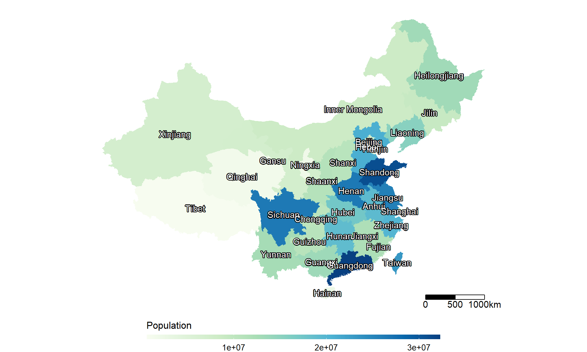
<p>The China map is more complicated. <a href="http://imzhen.com/note/2015/09/16/20150916/">This blog by Zhang Zhen</a> refers to several useful resources, especially the older Capital of Statistics post on <a href="https://cosx.org/2009/07/drawing-china-map-using-r">drawing China maps in R</a>. I have not found a China equivalent of <code>usmap</code>, but the workflow is manageable once the shapefiles are available.</p>
<p>The shapefiles can be downloaded from <a href="https://uploads.cosx.org/2009/07/chinaprovinceborderdata_tar_gz.zip">the Capital of Statistics website</a>. The zip file contains three files: <code>bou2_4p.dbf</code>, <code>bou2_4p.shp</code>, and <code>bou2_4p.shx</code>. We only need the <code>bou2_4p.shp</code> file later.<br />
For a quick download: you can also download from my GitHub repo of <code>blogdown</code>: <a href="https://github.com/liuyanguu/Blogdown/">Blogdown/blogData/China.shp</a></p>
<p><strong>Update 2020/06</strong>
There is a <a href="https://github.com/GuangchuangYu/chinamap"><code>chinamap</code></a> package created by Guangchuang Yu (and his team), who is also the author of the package <a href="https://github.com/GuangchuangYu/nCov2019"><code>nCov2019</code></a>.</p>
<p>Another useful source is the <a href="https://gadm.org/">GADM website</a>, which has admin1 and admin2 shapefiles for every country. Note that China and Taiwan are downloaded separately.</p>
<p><strong>On character encoding</strong>
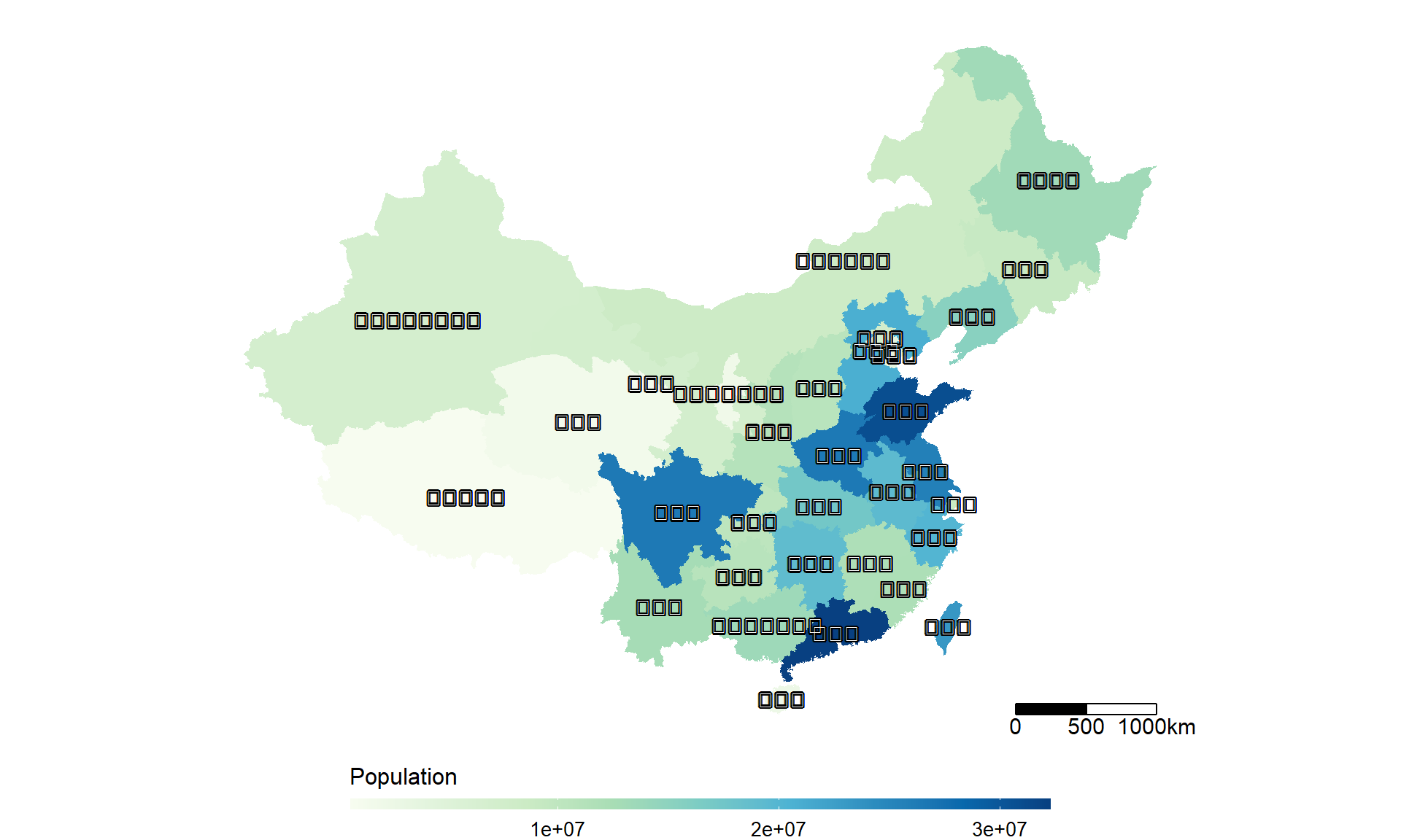
Showing Chinese is indeed sometimes a problem. The key is to make sure in the datafile all the province names are coded in UTF-8. In the markdown file below you can see province names shown as UTF-8 code. But if in the map (plot) they are rendered as Chinese characters. And if your system can show Chinese, they read as Chinese in the console too.</p>
<p>In Chinese (一点额外说明):
在Windows系统上,只要RStudio中显示中文没有问题好像Markdown的时候就没有问题。关键是要统一数据中的中文都是UTF-8编码的,不要从网站上拷贝中文进Rstudio,会产生各种问题。不需要特别调整Rstudio或者Markdown的设置。
所以虽然我下面的数据中显示UTF-8,在Console和最后在地图上都是显示为中文。</p>
<pre class="r"><code># China -------------------------------------------------------------------
china_map <- rgdal::readOGR(here::here("../Data/China.shp/bou2_4p.shp")) # read it locally</code></pre>
<pre><code>## OGR data source with driver: ESRI Shapefile
## Source: "D:\liuyanguu\Blogdown\Data\China.shp\bou2_4p.shp", layer: "bou2_4p"
## with 925 features
## It has 7 fields
## Integer64 fields read as strings: BOU2_4M_ BOU2_4M_ID</code></pre>
<pre class="r"><code># extract province information from shapefile
china_map_data = data.table::setDT(china_map@data)
data.table::setnames(china_map_data, "NAME", "province")
# transform to UTF-8 coding format
china_map_data[, province:=iconv(province, from = "GBK", to = "UTF-8")]
# create id to join province back to lat and long, id = 0 ~ 924
china_map_data[, id:= .I-1] # id = 0, 1, 2, ... , used to match to `dt_china`
# there are more shapes for one province due to small islands
china_map_data[, province:= as.factor(province)]
china_map_data <- china_map_data[!is.na(province)]
china_map_data <- china_map_data[AREA > 0.1]
head(china_map_data, 3)</code></pre>
<pre><code>## AREA PERIMETER BOU2_4M_ BOU2_4M_ID ADCODE93 ADCODE99 province id
## 1: 54.447 68.489 2 23 230000 230000 黑龙江省 0
## 2: 129.113 129.933 3 15 150000 150000 内蒙古自治区 1
## 3: 175.591 84.905 4 65 650000 650000 新疆维吾尔自治区 2</code></pre>
<pre class="r"><code>#
dt_china = setDT(fortify(china_map))
head(dt_china, 3)</code></pre>
<pre><code>## long lat order hole piece id group
## 1: 121.4884 53.33265 1 FALSE 1 0 0.1
## 2: 121.4995 53.33601 2 FALSE 1 0 0.1
## 3: 121.5184 53.33919 3 FALSE 1 0 0.1</code></pre>
<pre class="r"><code>dt_china[, id:= as.numeric(id)]
setkey(china_map_data, id); setkey(dt_china, id)
dt_china <- china_map_data[dt_china]
# add the province EN, CH label file
province_CH <- china_map_data[, levels(province)] # the CH are in UTF-8 code
province_EN <- c("Shanghai", "Yunnan", "Inner Mongolia", "Beijing", "Taiwan",
"Jilin", "Sichuan", "Tianjin", "Ningxia", "Anhui",
"Shandong", "Shanxi", "Guangdong", "Guangxi", "Xinjiang",
"Jiangsu", "Jiangxi", "Hebei", "Henan", "Zhejiang",
"Hainan", "Hubei", "Hunan", "Gansu", "Fujian",
"Tibet", "Guizhou", "Liaoning", "Chongqing", "Shaanxi",
"Qinghai", "Hong Kong", "Heilongjiang"
)
# some value to plot (from years ago too)
value <- c(8893483, 12695396, 8470472, 7355291, 23193638, 9162183, 26383458, 3963604, 1945064, 19322432, 30794664, 10654162, 32222752, 13467663, 6902850, 25635291, 11847841, 20813492, 26404973, 20060115, 2451819, 17253385, 19029894, 7113833, 11971873, 689521, 10745630, 15334912, 10272559, 11084516, 1586635, 7026400, 13192935)
input_data <- data.table(province_CH, province_EN, value)
setkey(input_data, province_CH)
setkey(dt_china, province)
dt_china <- input_data[dt_china, nomatch = 0]
# saveRDS(dt_china, file = "D:/liuyanguu/Blogdown/Data/dt_china.rds")
# create label file of province `label_dt`
centroids_cn <- get.centroids(data = dt_china, by_var = "province_CH")
centroids_en <- get.centroids(data = dt_china, by_var = "province_EN")
# plot
gg_cn <- ggplot(dt_china, aes(x = long, y = lat, group = group, fill = value)) +
labs(fill = "Population")+
geom_polygon()+
scale_fill_gradientn(colours = RColorBrewer::brewer.pal(9, "GnBu"),
na.value = "grey90",
guide = guide_colourbar(barwidth = 25, barheight = 0.4,
#put legend title on top of legend
title.position = "top")) +
labs(fill = "Population", x = "Longitude", y = "Latitude") +
coord_map() +
# map scale
ggsn::scalebar(data = dt_china, dist = 500, dist_unit = "km",
border.size = 0.4, st.size = 4,
box.fill = c('black','white'),
transform = TRUE, model = "WGS84") +
theme_void() +
theme(legend.position = "bottom",
legend.title=element_text(size=12), # font size of the legend
legend.text=element_text(size=10))
# In Chinese
gg_cn + shadowtext::geom_shadowtext(data = centroids_cn, aes(x = long, y = lat, label = name), inherit.aes = FALSE)</code></pre>
<p><img src="2019-04-17-ggplot-heatmap-us-50-states-map-and-china-province-map_files/figure-html/unnamed-chunk-4-1.png" width="960" /></p>
<pre class="r"><code># In English
gg_cn + shadowtext::geom_shadowtext(data = centroids_en, aes(x = long, y = lat, label = name), inherit.aes = FALSE)</code></pre>
<p><img src="2019-04-17-ggplot-heatmap-us-50-states-map-and-china-province-map_files/figure-html/unnamed-chunk-4-2.png" width="960" /></p>
</div>
<div id="method-2.-using-geojsonmap-leaflet" class="section level2">
<h2>Method 2. Using geojsonMap (leaflet)</h2>
<p>Just saw it on <a href="https://cosx.org/2017/03/air-quality-visualization/">cosx.org blog</a>.
It is an interactive map built on <code>leaflet</code>.</p>
<pre class="r"><code>library(leafletCN)
dt_china <- as.data.frame(dt_china)
geojsonMap(dat = dt_china, mapName = "china",
# namevar = ~ province_EN,
valuevar = ~ value,
popup = paste0(dt_china$province_EN),
palette = RColorBrewer::brewer.pal(9, "GnBu"), legendTitle = "Population")</code></pre>
<div id="htmlwidget-1" style="width:960px;height:576px;" class="leaflet html-widget"></div>
<script type="application/json" data-for="htmlwidget-1">{"x":{"options":{"crs":{"crsClass":"L.CRS.EPSG3857","code":null,"proj4def":null,"projectedBounds":null,"options":{}}},"calls":[{"method":"addTiles","args":["http://webrd02.is.autonavi.com/appmaptile?lang=zh_cn&size=1&scale=1&style=8&x={x}&y={y}&z={z}",{"minZoom":3,"maxZoom":17,"tileSize":256,"subdomains":"abc","errorTileUrl":"","tms":false,"noWrap":false,"zoomOffset":0,"zoomReverse":false,"opacity":1,"zIndex":1,"detectRetina":false},null,{"minZoom":0,"maxZoom":18,"tileSize":256,"subdomains":"abc","errorTileUrl":"","tms":false,"noWrap":false,"zoomOffset":0,"zoomReverse":false,"opacity":1,"zIndex":1,"detectRetina":false,"attribution":"© <a href=\"http://amap.com\">amp.com<\/a >"}]},{"method":"addPolygons","args":[[[[{"lng":[96.416,96.416,95.9766,96.0645,96.2402,95.9766,95.2734,95.1855,94.5703,94.043,93.8672,93.0762,92.6367,92.373,92.373,92.373,90.1758,90.3516,90.6152,90.5273,91.0547,91.3184,90.7031,90.791,91.0547,91.0547,90.8789,90,89.9121,89.7363,89.209,88.7695,88.5938,87.3633,86.2207,86.1328,85.6055,85.0781,84.1992,83.1445,82.8809,82.4414,82.002,81.6504,80.4199,80.2441,80.332,80.2441,79.8926,79.8047,79.1016,79.0137,78.2227,78.0469,78.0469,77.4316,76.8164,76.5527,76.2012,75.9375,76.0254,75.8496,75.498,75.4102,75.0586,74.8828,74.7949,74.5313,74.5313,74.8828,75.1465,74.8828,74.9707,74.8828,74.3555,74.1797,74.0918,73.8281,73.7402,73.8281,73.4766,73.916,73.916,73.8281,74.0039,74.8828,74.7949,75.2344,75.5859,75.7617,76.377,76.9043,77.6074,78.1348,78.1348,80.1563,80.2441,80.1563,80.2441,80.5078,80.4199,80.7715,80.4199,80.4199,79.9805,79.9805,81.7383,82.0898,82.5293,82.2656,83.0566,83.6719,84.7266,84.9023,85.5176,85.6934,85.5176,85.7813,86.5723,86.8359,86.748,86.8359,87.8027,87.8906,87.7148,88.0664,87.9785,88.5059,88.6816,89.1211,89.5605,89.7363,90.0879,90.3516,90.5273,90.8789,91.0547,90.8789,91.0547,90.7031,90.7031,90.8789,91.582,93.5156,94.7461,95.3613,95.3613,95.5371,95.8887,96.3281,96.416],"lat":[42.7588,42.7148,42.4951,42.3193,42.2314,41.9238,41.6162,41.792,41.4844,41.0889,40.6934,40.6494,39.6387,39.3311,39.1113,39.0234,38.4961,38.2324,38.3203,37.8369,37.4414,37.0898,36.7822,36.6064,36.5186,36.0791,36.0352,36.2549,36.0791,36.0791,36.2988,36.3428,36.4746,36.4307,36.167,35.8594,35.6836,35.7275,35.376,35.4199,35.6836,35.7275,35.332,35.2441,35.4199,35.2881,35.1563,35.2002,34.8047,34.4971,34.4531,34.3213,34.7168,35.2441,35.5078,35.4639,35.6396,35.8594,35.8154,36.0352,36.4746,36.6943,36.7383,36.958,37.002,36.9141,37.0459,37.0898,37.2217,37.2217,37.4414,37.5732,37.749,38.4521,38.6719,38.6719,38.54,38.584,38.8477,38.9795,39.375,39.5068,39.6826,39.7705,40.0342,40.3418,40.5176,40.4297,40.6494,40.2979,40.3857,41.001,41.001,41.2207,41.3965,42.0557,42.2754,42.627,42.8467,42.8906,43.0664,43.1982,44.165,44.6045,44.8242,44.9561,45.3955,45.2197,45.2197,45.6592,47.2412,47.0215,47.0215,46.8896,47.0654,47.2852,48.1201,48.4277,48.5596,48.8232,48.9551,49.1309,49.1748,48.999,48.9111,48.7354,48.6035,48.3838,48.1641,47.9883,48.0322,47.8564,47.8564,47.6807,47.2412,46.9775,46.582,46.3184,46.0107,45.7471,45.5273,45.2197,45.0879,44.9561,44.3408,44.2969,44.0332,43.9014,43.2422,42.9346,42.7588]}]],[[{"lng":[79.0137,79.1016,79.8047,79.8926,80.2441,80.332,80.2441,80.4199,81.6504,82.002,82.4414,82.8809,83.1445,84.1992,85.0781,85.6055,86.1328,86.2207,87.3633,88.5938,88.7695,89.209,89.7363,89.3848,89.4727,89.7363,89.7363,89.4727,89.4727,89.5605,89.8242,89.7363,89.8242,89.6484,90.0879,90.7031,91.4063,91.9336,92.1973,92.2852,92.9883,93.5156,93.7793,94.1309,94.6582,95.1855,95.0098,95.1855,95.2734,95.3613,95.3613,95.4492,95.8008,95.9766,96.1523,96.2402,96.5039,96.8555,96.7676,97.2949,97.3828,97.7344,98.1738,98.4375,98.877,98.6133,98.9648,99.1406,98.9648,98.9648,98.7891,98.7891,98.7012,98.6133,98.7891,98.7012,98.3496,98.2617,98.1738,97.5586,97.2949,97.3828,97.0313,96.5039,95.7129,95.3613,95.2734,94.2188,93.8672,93.6035,92.1094,92.0215,91.582,91.582,91.4063,91.0547,90.7031,89.8242,89.6484,89.1211,89.1211,89.0332,88.7695,88.8574,88.6816,88.1543,87.8906,87.7148,87.0996,86.748,86.5723,86.4844,86.1328,86.0449,85.6934,85.6055,85.166,85.166,84.9023,84.4629,84.2871,84.1992,84.1113,83.584,83.2324,82.1777,82.0898,81.3867,81.2109,81.0352,80.0684,79.7168,79.0137,78.75,78.8379,78.6621,78.75,78.4863,78.3984,78.75,78.9258,79.2773,79.1016,78.6621,78.6621,78.9258,79.0137],"lat":[34.3213,34.4531,34.4971,34.8047,35.2002,35.1563,35.2881,35.4199,35.2441,35.332,35.7275,35.6836,35.4199,35.376,35.7275,35.6836,35.8594,36.167,36.4307,36.4746,36.3428,36.2988,36.0791,36.0352,35.9033,35.7715,35.4199,35.376,35.2441,34.8926,34.8486,34.6729,34.3652,34.0137,33.4863,33.1348,33.1348,32.8271,32.8271,32.7393,32.7393,32.4756,32.5635,32.4316,32.6074,32.4316,32.2998,32.3438,32.2119,32.168,31.9922,31.8164,31.6846,31.8164,31.5967,31.9482,31.7285,31.6846,31.9922,32.0801,32.5635,32.5195,32.3438,31.8604,31.4209,31.2012,30.7617,29.2676,29.1357,28.8281,28.8721,29.0039,28.916,28.5205,28.3447,28.2129,28.125,28.3887,28.125,28.5205,28.0811,27.9053,27.7295,28.125,28.2568,28.125,27.9492,27.5537,27.0264,26.9385,26.8506,27.4658,27.5537,27.9053,28.0371,27.8613,28.0811,28.2129,28.1689,27.5977,27.334,27.2021,27.4219,27.9932,28.125,27.9053,27.9492,27.8174,27.8174,28.125,28.125,27.9053,28.125,27.9053,28.3447,28.2568,28.3447,28.6523,28.5645,28.7402,28.8721,29.2236,29.2676,29.1797,29.5752,30.0586,30.3223,30.3662,30.0146,30.2344,30.5859,30.9375,31.0693,31.333,31.5967,31.8164,31.9043,32.124,32.5195,32.6953,32.3438,32.5635,33.1787,33.6621,34.1016,34.1455,34.3213]}]],[[{"lng":[97.207,99.4922,100.8105,101.7773,102.041,102.7441,103.3594,103.8867,104.502,104.502,105.0293,105.7324,107.4023,109.4238,110.3906,111.0059,111.9727,111.9727,111.4453,111.7969,111.9727,113.6426,114.1699,114.5215,115.6641,116.1914,116.2793,116.543,117.334,117.4219,117.7734,118.3008,118.7402,118.916,119.0918,119.707,119.9707,119.707,118.4766,117.8613,117.334,116.8066,116.1914,115.9277,115.5762,115.4883,115.8398,115.8398,116.7188,117.7734,118.5645,119.2676,119.3555,119.1797,119.5313,119.5313,119.707,120.1465,120.6738,120.7617,120.7617,120.5859,120.6738,120.4102,120.0586,120.0586,120.8496,121.4648,121.8164,121.2012,121.6406,121.7285,121.9922,122.168,122.6953,122.6074,122.959,123.3105,123.6621,124.3652,124.541,124.8926,125.0684,125.332,126.0352,125.7715,125.7715,125.332,125.1563,125.2441,124.8047,124.4531,124.2773,122.4316,123.0469,123.3984,123.3984,123.4863,123.5742,123.5742,123.5742,123.0469,123.2227,122.7832,122.6953,122.4316,122.2559,121.8164,121.7285,121.9043,122.2559,122.0801,122.3438,123.1348,123.4863,123.3105,123.6621,123.5742,123.3105,123.1348,122.7832,122.3438,122.3438,121.9922,121.7285,121.4648,120.498,120.1465,119.8828,119.5313,119.3555,119.2676,119.4434,119.2676,118.3887,118.125,118.3008,118.3008,118.125,117.9492,118.0371,117.7734,117.5098,117.334,116.8945,116.8066,116.2793,116.0156,115.9277,115.2246,114.9609,114.873,114.5215,114.1699,114.2578,113.9063,113.9941,113.9063,114.082,114.082,113.8184,113.5547,113.2031,112.7637,112.3242,111.9727,111.4453,111.3574,111.0938,111.0938,110.6543,110.127,110.2148,109.8633,109.9512,108.9844,109.0723,108.8965,108.8086,108.7207,108.1934,107.666,107.3145,106.7871,106.5234,106.9629,106.7871,106.3477,105.9082,105.8203,104.3262,103.4473,103.3594,103.5352,103.4473,104.2383,104.0625,103.3594,103.0078,102.4805,101.8652,102.041,101.7773,101.3379,101.25,100.9863,100.8105,100.5469,100.0195,99.4922,100.1074,100.1953,99.9316,99.2285,99.0527,98.9648,98.7891,98.5254,98.6133,98.3496,98.3496,97.4707,97.8223,97.8223,97.207],"lat":[42.8027,42.583,42.6709,42.4951,42.2314,42.1436,41.8799,41.792,41.8799,41.6602,41.5723,41.9238,42.4512,42.4512,42.7588,43.3301,43.6816,43.8135,44.3848,45,45.0879,44.7363,44.9561,45.3955,45.4395,45.7031,45.9668,46.2744,46.3623,46.582,46.5381,46.7578,46.7139,46.7578,46.6699,46.626,46.7139,47.1973,47.9883,48.0322,47.6807,47.9004,47.8564,47.6807,47.9004,48.1641,48.252,48.5596,49.834,49.5264,49.9219,50.0977,50.3174,50.3613,50.7568,50.8887,51.0645,51.6797,51.9434,52.1191,52.251,52.3389,52.5146,52.6465,52.6025,52.7344,53.2617,53.3496,53.042,52.5586,52.4268,52.2949,52.2949,52.5146,52.251,52.0752,51.3281,51.2402,51.3721,51.2842,51.3721,51.3721,51.6357,51.6357,51.0205,50.7568,50.5371,50.1416,49.834,49.1748,49.1309,48.1201,48.5156,47.373,46.7139,46.8896,46.9775,46.9775,46.8457,46.8896,46.6699,46.582,46.2305,46.0107,45.7031,45.8789,45.791,46.0107,45.7471,45.7031,45.2637,44.8682,44.2529,44.4727,43.7256,43.5059,43.374,43.0225,42.9785,42.8027,42.7148,42.8467,42.6709,42.7148,42.4512,42.4951,42.0996,41.7041,42.1875,42.3633,42.2754,41.7041,41.6162,41.3086,41.3086,41.748,41.792,42.0996,42.0557,42.2314,42.4072,42.627,42.583,42.4512,42.4072,42.0117,42.0117,41.792,41.9238,41.5723,41.6162,42.0996,42.1436,41.792,41.5723,41.4404,41.2207,41.1328,40.7373,40.5176,40.5176,40.3418,40.3857,40.166,40.2539,39.5947,39.6387,39.4189,39.375,39.5947,39.2871,39.4629,39.2871,39.2432,39.1553,38.3203,38.0127,37.9688,38.0127,37.7051,37.6172,37.8809,38.1006,38.1885,38.3203,38.9795,39.375,39.2871,38.7158,37.793,37.4414,37.8369,38.0127,38.1445,38.3643,38.9795,39.4189,39.3311,39.1113,39.2432,39.1113,38.8916,38.6719,38.7598,39.0234,38.9355,39.4189,39.4189,39.7705,39.8584,40.2539,40.6494,41.001,40.8691,40.6934,40.7813,40.6055,40.7373,40.6494,40.5615,40.9131,41.4844,41.6162,41.748,42.8027]}]],[[{"lng":[89.7363,89.9121,90,90.8789,91.0547,91.0547,90.791,90.7031,91.3184,91.0547,90.5273,90.6152,90.3516,90.1758,92.373,92.373,93.1641,93.1641,93.6914,93.8672,94.3066,94.5703,95.0098,95.4492,95.7129,96.2402,96.416,96.6797,96.6797,97.1191,97.0313,98.1738,98.3496,98.6133,98.7891,99.1406,99.8438,100.1953,100.0195,100.1074,100.459,100.7227,101.1621,101.5137,101.7773,101.9531,102.1289,102.5684,102.4805,102.6563,102.5684,102.832,103.0078,102.9199,102.9199,102.6563,102.832,102.4805,102.3047,102.3926,101.9531,101.9531,102.2168,102.1289,101.6895,100.9863,100.8105,101.25,101.5137,101.6016,101.7773,101.6895,101.7773,101.6016,101.1621,101.25,100.7227,100.7227,100.3711,100.1074,100.1074,99.8438,99.7559,99.2285,99.2285,98.877,98.4375,97.8223,97.6465,97.7344,97.3828,97.4707,97.7344,97.3828,97.4707,97.7344,97.3828,97.2949,96.7676,96.8555,96.5039,96.2402,96.1523,95.9766,95.8008,95.4492,95.3613,95.3613,95.2734,95.1855,95.0098,95.1855,94.6582,94.1309,93.7793,93.5156,92.9883,92.2852,92.1973,91.9336,91.4063,90.7031,90.0879,89.6484,89.8242,89.7363,89.8242,89.5605,89.4727,89.4727,89.7363,89.7363,89.4727,89.3848,89.7363],"lat":[36.0791,36.0791,36.2549,36.0352,36.0791,36.5186,36.6064,36.7822,37.0898,37.4414,37.8369,38.3203,38.2324,38.4961,39.0234,39.1113,39.1992,38.9795,38.9355,38.7158,38.7598,38.3643,38.4082,38.2764,38.3643,38.1006,38.2324,38.1885,38.4521,38.584,39.1992,38.8037,39.0234,38.9355,39.0674,38.9355,38.3643,38.2764,38.4521,38.4961,38.2764,38.2324,37.8369,37.8809,37.6172,37.7051,37.4414,37.1777,36.958,36.8262,36.7383,36.3428,36.2549,36.0791,35.9033,35.7715,35.5957,35.5957,35.4199,35.2002,34.8486,34.6289,34.4092,34.2773,34.1016,34.3652,34.2773,33.6621,33.7061,33.5303,33.5303,33.3105,33.2227,33.1348,33.2227,32.6953,32.6514,32.5195,32.7393,32.6514,32.8711,33.0029,32.7393,32.915,33.0469,33.1787,34.0576,34.1895,34.1016,33.9258,33.8818,33.5742,33.3984,32.8711,32.6953,32.5195,32.5635,32.0801,31.9922,31.6846,31.7285,31.9482,31.5967,31.8164,31.6846,31.8164,31.9922,32.168,32.2119,32.3438,32.2998,32.4316,32.6074,32.4316,32.5635,32.4756,32.7393,32.7393,32.8271,32.8271,33.1348,33.1348,33.4863,34.0137,34.3652,34.6729,34.8486,34.8926,35.2441,35.376,35.4199,35.7715,35.9033,36.0352,36.0791]}]],[[{"lng":[101.7773,101.8652,101.9531,101.8652,102.4805,102.2168,102.9199,103.0957,103.1836,104.1504,104.2383,104.4141,104.3262,104.4141,104.3262,104.4141,105.2051,105.3809,105.3809,105.4688,105.5566,106.084,106.084,106.3477,107.0508,107.1387,107.2266,107.4023,108.0176,108.2813,108.5449,108.3691,108.2813,108.5449,108.1934,107.9297,107.4902,107.4023,107.4902,107.0508,106.7871,106.6113,106.2598,105.8203,105.6445,105.5566,105.7324,105.293,105.4688,105.7324,105.8203,106.2598,106.3477,105.9961,105.6445,105.9082,106.1719,106.3477,105.6445,105.5566,105.293,105.2051,105.0293,104.8535,104.4141,104.3262,104.4141,104.4141,104.2383,104.4141,103.8867,103.7988,103.4473,103.4473,102.9199,103.0078,102.6563,102.5684,102.1289,101.8652,101.6016,101.6895,101.4258,101.4258,101.4258,101.1621,101.1621,100.7227,100.3711,100.2832,100.0195,100.1953,99.668,99.4043,99.4043,99.2285,99.1406,98.9648,98.6133,98.877,98.4375,98.1738,97.7344,97.4707,97.3828,97.7344,97.4707,97.3828,97.7344,97.6465,97.8223,98.4375,98.877,99.2285,99.2285,99.7559,99.8438,100.1074,100.1074,100.3711,100.7227,100.7227,101.25,101.1621,101.6016,101.7773,101.6895,101.7773],"lat":[33.5303,33.5742,33.4424,33.0908,33.4424,33.9258,34.3213,34.1895,33.7939,33.6182,33.3984,33.3105,33.2227,33.0469,32.8711,32.7393,32.6074,32.7393,32.8711,32.915,32.7393,32.8711,32.7393,32.6514,32.6953,32.4756,32.4316,32.5195,32.168,32.2559,32.2119,32.168,31.9043,31.6846,31.5088,30.8496,30.8496,30.7617,30.6299,30.0146,30.0146,30.3223,30.1904,30.4541,30.2783,30.1025,29.8828,29.5313,29.3115,29.2676,28.96,28.8721,28.5205,28.7402,28.4326,28.125,28.125,27.8174,27.6416,27.7734,27.7295,27.9932,28.0811,27.9053,27.9492,28.0371,28.125,28.2568,28.4326,28.6084,28.6523,28.3008,28.125,27.7734,27.29,26.3672,26.1914,26.3672,26.1035,26.0596,26.2354,26.3672,26.5869,26.8066,26.7188,27.0264,27.1582,27.8613,27.8174,27.7295,28.125,28.3447,28.8281,28.5205,28.1689,28.3008,29.2676,30.7617,31.2012,31.4209,31.8604,32.3438,32.5195,32.6953,32.8711,33.3984,33.5742,33.8818,33.9258,34.1016,34.1895,34.0576,33.1787,33.0469,32.915,32.7393,33.0029,32.8711,32.6514,32.7393,32.5195,32.6514,32.6953,33.2227,33.1348,33.2227,33.3105,33.5303]}]],[[{"lng":[121.4648,123.6621,124.8926,125.0684,125.5957,125.6836,126.123,126.0352,126.2109,126.3867,126.3867,126.5625,126.4746,126.9141,126.8262,127.002,126.9141,127.2656,127.3535,127.6172,127.5293,127.793,128.7598,129.1113,129.4629,130.2539,130.6934,130.5176,130.8691,130.6934,131.0449,132.5391,132.627,133.0664,133.5059,134.209,135.0879,134.7363,134.5605,134.7363,134.5605,134.3848,134.209,134.209,133.8574,133.9453,133.5059,133.418,133.2422,133.0664,132.8906,131.9238,131.5723,131.0449,131.3086,131.2207,131.3086,130.8691,130.5176,130.3418,129.9902,129.9023,129.8145,129.2871,129.1992,128.8477,128.4961,128.4082,128.0566,128.0566,127.7051,127.5293,127.0898,127.002,127.0898,126.9141,126.5625,126.0352,125.7715,125.6836,125.0684,124.8926,124.3652,124.0137,123.9258,123.2227,123.0469,123.5742,123.5742,123.5742,123.4863,123.3984,123.3984,123.0469,122.4316,124.2773,124.4531,124.8047,125.2441,125.1563,125.332,125.7715,125.7715,126.0352,125.332,125.0684,124.8926,124.541,124.3652,123.6621,123.3105,122.959,122.6074,122.6953,122.168,121.9922,121.7285,121.6406,121.2012,121.8164,121.4648],"lat":[53.3496,53.5693,53.0859,53.2178,53.0859,52.9102,52.7783,52.6025,52.5146,52.2949,52.207,52.1631,51.9434,51.3721,51.2842,51.3281,51.1084,50.7568,50.2734,50.2295,49.8779,49.6143,49.5703,49.3506,49.4385,48.8672,48.8672,48.6475,48.2959,48.1201,47.6807,47.7246,47.9443,48.1201,48.1201,48.3838,48.4277,48.252,47.9883,47.6807,47.4609,47.4609,47.2852,47.1533,46.5381,46.2744,45.835,45.5713,45.5273,45.1318,45.0439,45.3516,45.0439,44.8682,44.0771,43.7256,43.4619,43.418,43.6377,43.9893,43.8574,44.0332,43.9014,43.8135,43.5938,43.5498,44.165,44.4727,44.3408,44.1211,44.1211,44.6045,44.6045,44.7803,45,45.1318,45.2637,45.1758,45.3076,45.5273,45.3955,45.5273,45.4395,45.7471,46.2305,46.2305,46.582,46.6699,46.8896,46.8457,46.9775,46.9775,46.8896,46.7139,47.373,48.5156,48.1201,49.1309,49.1748,49.834,50.1416,50.5371,50.7568,51.0205,51.6357,51.6357,51.3721,51.3721,51.2842,51.3721,51.2402,51.3281,52.0752,52.251,52.5146,52.2949,52.2949,52.4268,52.5586,53.042,53.3496]}]],[[{"lng":[96.416,97.207,97.8223,97.8223,97.4707,98.3496,98.3496,98.6133,98.5254,98.7891,98.9648,99.0527,99.2285,99.9316,100.1953,100.1074,99.4922,100.0195,100.5469,100.8105,100.9863,101.25,101.3379,101.7773,102.041,101.8652,102.4805,103.0078,103.3594,104.0625,104.2383,103.4473,103.5352,103.3594,103.4473,104.3262,104.5898,104.5898,104.8535,105.293,105.2051,105.4688,105.293,105.3809,105.7324,105.8203,105.9961,105.9082,105.9961,106.084,106.2598,106.3477,106.5234,106.4355,106.6992,106.9629,106.875,106.5234,106.5234,106.4355,106.6113,106.6113,107.3145,107.3145,108.7207,108.6328,108.5449,108.6328,108.5449,107.7539,107.7539,107.8418,107.666,107.2266,106.9629,106.6113,106.5234,106.3477,106.6992,106.5234,106.6113,106.4355,106.5234,105.9961,105.7324,105.9961,105.9082,105.4688,105.3809,105.3809,105.2051,104.4141,104.3262,104.4141,104.3262,104.4141,104.2383,104.1504,103.1836,103.0957,102.9199,102.2168,102.4805,101.8652,101.9531,101.8652,101.7773,101.6016,101.5137,101.25,100.8105,100.9863,101.6895,102.1289,102.2168,101.9531,101.9531,102.3926,102.3047,102.4805,102.832,102.6563,102.9199,102.9199,103.0078,102.832,102.5684,102.6563,102.4805,102.5684,102.1289,101.9531,101.7773,101.5137,101.1621,100.7227,100.459,100.1074,100.0195,100.1953,99.8438,99.1406,98.7891,98.6133,98.3496,98.1738,97.0313,97.1191,96.6797,96.6797,96.416,96.2402,95.7129,95.4492,95.0098,94.5703,94.3066,93.8672,93.6914,93.1641,93.1641,92.373,92.373,92.6367,93.0762,93.8672,94.043,94.5703,95.1855,95.2734,95.9766,96.2402,96.0645,95.9766,96.416],"lat":[42.7148,42.8027,41.748,41.6162,41.4844,40.9131,40.5615,40.6494,40.7373,40.6055,40.7813,40.6934,40.8691,41.001,40.6494,40.2539,39.8584,39.7705,39.4189,39.4189,38.9355,39.0234,38.7598,38.6719,38.8916,39.1113,39.2432,39.1113,39.3311,39.4189,38.9795,38.3643,38.1445,38.0127,37.8369,37.4414,37.4414,37.2217,37.2217,36.8262,36.6943,36.123,35.9912,35.7715,35.7275,35.5518,35.4639,35.4199,35.4199,35.376,35.4199,35.2441,35.332,35.6836,35.6836,35.8154,36.123,36.2549,36.4746,36.5625,36.7822,37.0898,37.0898,36.9141,36.3428,35.9912,35.8594,35.5518,35.2881,35.2881,35.1123,35.0244,34.9365,34.8926,35.0684,35.0684,34.7607,34.585,34.3213,34.2773,34.1455,33.9258,33.5303,33.6182,33.3984,33.1787,33.0029,32.915,32.8711,32.7393,32.6074,32.7393,32.8711,33.0469,33.2227,33.3105,33.3984,33.6182,33.7939,34.1895,34.3213,33.9258,33.4424,33.0908,33.4424,33.5742,33.5303,33.5303,33.7061,33.6621,34.2773,34.3652,34.1016,34.2773,34.4092,34.6289,34.8486,35.2002,35.4199,35.5957,35.5957,35.7715,35.9033,36.0791,36.2549,36.3428,36.7383,36.8262,36.958,37.1777,37.4414,37.7051,37.6172,37.8809,37.8369,38.2324,38.2764,38.4961,38.4521,38.2764,38.3643,38.9355,39.0674,38.9355,39.0234,38.8037,39.1992,38.584,38.4521,38.1885,38.2324,38.1006,38.3643,38.2764,38.4082,38.3643,38.7598,38.7158,38.9355,38.9795,39.1992,39.1113,39.3311,39.6387,40.6494,40.6934,41.0889,41.4844,41.792,41.6162,41.9238,42.2314,42.3193,42.4951,42.7148]}]],[[{"lng":[98.1738,98.2617,98.3496,98.7012,98.7891,98.6133,98.7012,98.7891,98.7891,98.9648,98.9648,99.1406,99.2285,99.4043,99.4043,99.668,100.1953,100.0195,100.2832,100.3711,100.7227,101.1621,101.1621,101.4258,101.4258,101.4258,101.6895,101.6016,101.8652,102.1289,102.5684,102.6563,103.0078,102.9199,103.4473,103.4473,103.7988,103.8867,104.4141,104.2383,104.4141,104.4141,104.3262,104.4141,104.8535,105.0293,105.2051,105.293,105.2051,104.5898,104.4141,104.1504,103.8867,103.623,103.7109,103.7109,103.8867,104.4141,104.6777,104.3262,104.8535,104.5898,104.6777,104.502,104.6777,104.7656,105.0293,105.2051,105.4688,105.5566,105.9961,106.1719,106.1719,105.6445,105.5566,105.293,104.8535,104.7656,104.3262,104.1504,103.9746,103.623,103.5352,103.3594,103.0957,102.4805,102.3047,101.8652,101.7773,101.6016,101.8652,101.7773,101.6016,101.25,101.1621,100.6348,100.1074,99.9316,99.2285,99.4043,99.3164,99.4922,98.877,98.7012,98.877,98.1738,97.7344,97.5586,97.7344,97.6465,97.5586,97.5586,97.7344,97.8223,98.1738,98.1738,98.3496,98.5254,98.7012,98.6133,98.7012,98.7891,98.7012,98.5254,98.3496,98.1738],"lat":[28.125,28.3887,28.125,28.2129,28.3447,28.5205,28.916,29.0039,28.8721,28.8281,29.1357,29.2676,28.3008,28.1689,28.5205,28.8281,28.3447,28.125,27.7295,27.8174,27.8613,27.1582,27.0264,26.7188,26.8066,26.5869,26.3672,26.2354,26.0596,26.1035,26.3672,26.1914,26.3672,27.29,27.7734,28.125,28.3008,28.6523,28.6084,28.4326,28.2568,28.125,28.0371,27.9492,27.9053,28.0811,27.9932,27.7295,27.3779,27.334,27.4658,27.2461,27.4219,27.0264,26.9824,26.7627,26.543,26.6748,26.4111,25.708,25.2246,25.0488,24.9609,24.7412,24.3457,24.4775,24.4336,24.082,24.0381,24.126,24.126,23.8184,23.5547,23.4229,23.2031,23.3789,23.1592,22.8516,22.6758,22.8076,22.5439,22.7637,22.5879,22.8076,22.4561,22.7637,22.4121,22.3682,22.5,22.1924,21.6211,21.1377,21.2256,21.1816,21.7529,21.4453,21.4893,22.0605,22.1484,22.5879,22.7197,23.0713,23.2031,23.9502,24.126,24.082,23.8623,23.9063,24.126,24.4336,24.4336,24.7412,24.8291,25.2686,25.4004,25.6201,25.5762,25.8398,25.8838,26.0596,26.1475,26.5869,27.5098,27.6416,27.5098,28.125]}]],[[{"lng":[104.502,104.6777,105.2051,105.9961,106.1719,106.1719,106.875,107.0508,106.9629,107.2266,107.4902,107.7539,107.8418,108.1055,108.1934,108.3691,108.6328,108.6328,109.0723,108.9844,109.3359,109.5117,109.7754,109.9512,110.2148,110.5664,111.1816,111.2695,111.2695,111.4453,111.0059,111.0938,111.3574,111.5332,111.709,112.0605,111.8848,112.0605,111.8848,111.8848,111.7969,111.6211,111.6211,111.3574,111.4453,111.2695,110.7422,110.7422,110.6543,110.3027,110.3027,109.9512,109.8633,109.7754,109.7754,109.5996,109.1602,109.248,109.0723,109.0723,108.7207,108.6328,108.2813,107.8418,107.4023,107.0508,107.0508,106.6992,106.6113,106.7871,106.6992,105.9082,105.5566,105.5566,105.6445,106.1719,106.1719,105.9961,105.5566,105.4688,105.2051,105.0293,104.7656,104.6777,104.502],"lat":[24.7412,24.6094,24.9609,24.6533,24.7852,24.9609,25.1807,25.2686,25.4883,25.6201,25.2246,25.2246,25.1367,25.2246,25.4443,25.5322,25.3125,25.5762,25.5322,25.752,25.708,26.0156,25.8838,26.1914,25.9717,26.3232,26.3232,26.2354,25.8838,25.8398,25.0049,24.9609,25.1367,24.6533,24.7852,24.7412,24.6533,24.3457,24.2139,23.9941,23.8184,23.8184,23.6865,23.4668,23.0273,22.8076,22.5439,22.2803,22.1484,22.1484,21.8848,21.8408,21.665,21.6211,21.4014,21.4453,21.3574,20.874,20.9619,21.5332,21.5332,21.665,21.4893,21.6211,21.6211,21.7969,21.9287,22.0166,22.4121,22.7637,22.8955,22.9395,23.0713,23.2031,23.4229,23.5547,23.8184,24.126,24.126,24.0381,24.082,24.4336,24.4775,24.3457,24.7412]}]],[[{"lng":[109.248,109.248,109.5117,109.6875,109.7754,110.4785,110.6543,110.4785,110.8301,111.7969,112.2363,112.5,112.6758,112.9395,113.0273,112.9395,113.0273,113.5547,113.5547,113.7305,113.6426,113.7305,113.9063,114.1699,114.082,114.2578,113.7305,113.6426,113.6426,113.8184,113.7305,113.9063,113.9063,114.082,113.9941,114.2578,113.9941,113.9063,113.6426,113.2031,112.8516,113.0273,113.0273,112.8516,112.5879,112.2363,112.1484,112.0605,111.709,111.5332,111.3574,111.0938,111.0059,111.4453,111.2695,111.2695,111.1816,110.5664,110.2148,109.9512,109.7754,109.5117,109.4238,109.248,109.4238,109.3359,109.5117,109.5117,109.3359,108.8965,108.8086,109.4238,109.3359,109.3359,109.248],"lat":[28.4766,29.1357,29.6191,29.6191,29.751,29.6631,29.751,30.0146,30.1465,29.9268,29.5313,29.6191,29.5752,29.7949,29.751,29.4873,29.4434,29.8389,29.707,29.5752,29.3115,29.0918,29.0479,28.8281,28.5645,28.3447,27.9492,27.5977,27.3779,27.29,27.1143,26.9385,26.6309,26.5869,26.1914,26.1475,26.0596,25.4443,25.3125,25.5322,25.3564,25.2246,24.9609,24.917,25.1367,25.1807,24.873,24.7412,24.7852,24.6533,25.1367,24.9609,25.0049,25.8398,25.8838,26.2354,26.3232,26.3232,25.9717,26.1914,25.8838,26.0156,26.2793,26.3232,26.5869,26.7188,26.8066,27.0264,27.1582,27.0264,27.1143,27.5977,27.9053,28.2568,28.4766]}]],[[{"lng":[105.4688,105.9082,105.9961,105.7324,105.9961,106.5234,106.4355,106.6113,106.5234,106.6992,106.3477,106.5234,106.6113,106.9629,107.2266,107.666,107.8418,107.7539,107.7539,108.5449,108.6328,108.5449,108.6328,108.7207,107.3145,107.3145,107.3145,107.666,108.1934,108.7207,108.8086,108.8965,109.0723,108.9844,109.9512,109.8633,110.2148,110.127,110.6543,111.0938,111.0938,111.1816,110.918,110.8301,110.4785,110.4785,110.8301,110.3906,110.4785,110.5664,110.2148,110.2148,110.3906,110.4785,110.6543,110.6543,111.0059,111.0059,110.7422,110.5664,110.3027,109.5996,109.4238,109.7754,109.7754,110.127,110.127,109.6875,109.5117,109.5996,109.248,109.0723,108.5449,108.2813,108.0176,107.4023,107.2266,107.1387,107.0508,106.3477,106.084,106.084,105.5566,105.4688],"lat":[32.915,33.0029,33.1787,33.3984,33.6182,33.5303,33.9258,34.1455,34.2773,34.3213,34.585,34.7607,35.0684,35.0684,34.8926,34.9365,35.0244,35.1123,35.2881,35.2881,35.5518,35.8594,35.9912,36.3428,36.9141,37.0898,37.6172,37.8809,37.6172,37.7051,38.0127,37.9688,38.0127,38.3203,39.1553,39.2432,39.2871,39.4629,39.2871,39.5947,39.375,39.2432,38.7158,38.4961,38.1885,37.9688,37.6611,37.002,36.123,35.6396,34.8926,34.6729,34.585,34.2334,34.1455,33.8379,33.5303,33.2666,33.1348,33.2666,33.1787,33.2666,33.1348,33.0469,32.915,32.7393,32.6074,32.6074,32.4316,31.7285,31.7285,31.9482,32.2119,32.2559,32.168,32.5195,32.4316,32.4756,32.6953,32.6514,32.7393,32.8711,32.7393,32.915]}]],[[{"lng":[109.7754,109.7754,109.8633,109.9512,110.3027,110.3027,110.6543,110.7422,110.7422,111.2695,111.4453,111.3574,111.6211,111.6211,111.7969,111.8848,111.8848,112.0605,111.8848,112.0605,112.1484,112.2363,112.5879,112.8516,113.0273,113.0273,112.8516,113.2031,113.6426,113.9063,113.9941,114.6094,114.7852,114.6973,114.4336,114.1699,114.4336,115.4004,115.8398,115.752,115.9277,116.2793,116.3672,116.543,116.7188,116.9824,116.9824,117.1582,117.334,116.8945,116.6309,116.543,115.9277,115.6641,115.5762,115.0488,114.6094,114.3457,113.9941,113.8184,114.3457,114.4336,114.082,113.9941,113.5547,113.1152,112.9395,112.4121,112.2363,111.5332,111.2695,110.7422,110.6543,110.7422,110.4785,110.6543,110.5664,110.3906,110.0391,109.8633,109.8633,109.5996,109.7754,109.7754],"lat":[21.4014,21.6211,21.665,21.8408,21.8848,22.1484,22.1484,22.2803,22.5439,22.8076,23.0273,23.4668,23.6865,23.8184,23.8184,23.9941,24.2139,24.3457,24.6533,24.7412,24.873,25.1807,25.1367,24.917,24.9609,25.2246,25.3564,25.5322,25.3125,25.4443,25.2686,25.4004,25.2686,25.1367,24.9609,24.6973,24.5215,24.7852,24.5654,24.7852,24.917,24.7852,24.873,24.6094,24.6533,24.1699,23.9063,23.5547,23.2471,23.3789,23.1152,22.8516,22.7197,22.7637,22.6318,22.6758,22.3682,22.5439,22.5,22.1924,22.1484,22.0166,21.9287,21.7969,22.0166,21.8408,21.5771,21.4453,21.5332,21.4893,21.3574,21.3574,21.2256,20.918,20.874,20.2588,20.2588,20.127,20.127,20.127,20.3027,20.918,21.4014,21.4014]}],[{"lng":[113.5986,113.6096,113.5547,113.5437,113.5767,113.5986],"lat":[22.1649,22.1265,22.11,22.2034,22.2034,22.1649]}]],[[{"lng":[123.2227,123.9258,124.0137,124.3652,124.8926,125.0684,125.6836,125.7715,126.0352,126.5625,126.9141,127.0898,127.002,127.0898,127.5293,127.7051,128.0566,128.0566,128.4082,128.4961,128.8477,129.1992,129.2871,129.8145,129.9023,129.9902,130.3418,130.5176,130.8691,131.3086,131.3086,131.1328,130.4297,130.6055,130.6055,130.2539,130.2539,130.166,129.9023,129.7266,129.375,128.9355,128.0566,128.3203,128.1445,127.0898,127.1777,126.9141,126.6504,126.4746,126.123,125.6836,125.5957,125.7715,125.332,125.332,125.4199,125.332,124.8926,124.8926,124.7168,124.4531,124.2773,123.8379,123.6621,123.3105,123.4863,123.1348,122.3438,122.0801,122.2559,121.9043,121.7285,121.8164,122.2559,122.4316,122.6953,122.7832,123.2227],"lat":[46.2305,46.2305,45.7471,45.4395,45.5273,45.3955,45.5273,45.3076,45.1758,45.2637,45.1318,45,44.7803,44.6045,44.6045,44.1211,44.1211,44.3408,44.4727,44.165,43.5498,43.5938,43.8135,43.9014,44.0332,43.8574,43.9893,43.6377,43.418,43.4619,43.3301,42.9346,42.7148,42.6709,42.4512,42.7588,42.8906,42.9785,43.0225,42.4951,42.4512,42.0117,42.0117,41.5723,41.3525,41.5283,41.5723,41.792,41.6602,41.3965,40.957,40.8691,40.9131,41.2207,41.6602,41.9678,42.0996,42.1436,42.8027,43.0664,43.0664,42.8467,43.2422,43.4619,43.374,43.5059,43.7256,44.4727,44.2529,44.8682,45.2637,45.7031,45.7471,46.0107,45.791,45.8789,45.7031,46.0107,46.2305]}]],[[{"lng":[114.5215,114.3457,113.9941,114.5215,114.3457,114.2578,114.082,113.9063,113.9941,113.9063,114.2578,114.1699,114.5215,114.873,114.9609,115.2246,115.9277,116.0156,116.2793,116.8066,116.8945,117.334,117.5098,117.7734,118.0371,117.9492,118.125,118.3008,118.3008,118.125,118.3887,119.2676,118.8281,119.2676,119.5313,119.707,119.8828,119.5313,119.4434,118.916,118.4766,118.125,118.0371,118.0371,117.8613,117.9492,117.6855,117.5098,117.5098,117.6855,117.6855,117.4219,117.2461,117.4219,116.9824,116.6309,116.3672,116.4551,116.1914,116.1035,115.752,115.9277,115.4004,115.4883,115.752,116.1914,116.3672,116.543,116.8066,116.8945,116.7188,116.7188,117.2461,117.5977,117.9492,117.4219,116.8066,116.4551,116.2793,116.2793,116.0156,115.752,115.3125,115.4883,115.3125,115.1367,114.9609,114.873,113.7305,113.4668,113.7305,113.7305,114.1699,113.9941,113.8184,113.5547,113.5547,113.8184,113.8184,113.9063,114.3457,114.5215],"lat":[39.5068,39.8584,39.9902,40.3418,40.3857,40.6055,40.7373,41.1328,41.2207,41.4404,41.5723,41.792,42.1436,42.0996,41.6162,41.5723,41.9238,41.792,42.0117,42.0117,42.4072,42.4512,42.583,42.627,42.4072,42.2314,42.0557,42.0996,41.792,41.748,41.3086,41.3086,40.8252,40.5176,40.5615,40.1221,39.9463,39.6826,39.4189,39.0674,38.9355,39.0234,39.1992,39.2432,39.4189,39.5947,39.5947,39.7705,39.9902,39.9902,40.0781,40.21,40.5176,40.6494,40.6934,41.0449,40.9131,40.7813,40.7813,40.6055,40.5615,40.2539,39.9463,39.6387,39.5068,39.5947,39.4629,39.5947,39.5947,39.1113,38.9355,38.8037,38.54,38.6279,38.3203,37.8369,37.8369,37.4854,37.5732,37.3535,37.3535,36.9141,36.5186,36.167,36.0791,36.2109,36.0791,36.123,36.3428,36.6504,36.8701,37.1338,37.6611,37.7051,38.1445,38.2764,38.54,38.8037,38.9355,39.0234,39.0674,39.5068]}],[{"lng":[117.2461,117.1582,117.1582,116.8945,116.8945,116.8066,117.2461],"lat":[40.0781,39.8145,39.6387,39.6826,39.8145,39.9902,40.0781]}]],[[{"lng":[110.2148,110.127,109.6875,109.7754,109.5996,109.5117,109.6875,110.127,110.127,109.7754,109.7754,109.4238,109.5996,110.3027,110.5664,110.7422,111.0059,111.5332,112.3242,113.2031,113.4668,113.7305,113.8184,113.9941,114.1699,114.5215,114.6094,114.7852,115.1367,115.2246,115.4004,115.5762,116.0156,115.752,116.1035,116.1035,115.9277,115.4883,114.873,114.2578,113.9063,113.7305,113.6426,113.7305,113.5547,113.5547,113.0273,112.9395,113.0273,112.9395,112.6758,112.5,112.2363,111.7969,110.8301,110.4785,110.6543,110.4785,109.7754,109.6875,109.5117,109.248,109.0723,108.9844,108.6328,108.457,108.5449,108.457,108.6328,108.8086,109.0723,109.1602,109.248,109.4238,109.8633,110.0391,110.2148],"lat":[31.1572,31.377,31.5527,31.6846,31.7285,32.4316,32.6074,32.6074,32.7393,32.915,33.0469,33.1348,33.2666,33.1787,33.2666,33.1348,33.2666,32.6074,32.3438,32.4316,32.2998,32.4316,31.8604,31.7725,31.8604,31.7725,31.5527,31.4648,31.5967,31.4209,31.4209,31.2012,31.0254,30.6738,30.1904,29.8389,29.707,29.7949,29.3994,29.3555,29.0479,29.0918,29.3115,29.5752,29.707,29.8389,29.4434,29.4873,29.751,29.7949,29.5752,29.6191,29.5313,29.9268,30.1465,30.0146,29.751,29.6631,29.751,29.6191,29.6191,29.1357,29.3555,29.3115,29.8389,29.7949,30.2344,30.4102,30.5859,30.498,30.6299,30.542,30.6299,30.542,30.8936,30.8057,31.1572]}]],[[{"lng":[104.1504,104.4141,104.5898,105.2051,105.293,105.5566,105.6445,106.3477,106.1719,105.9082,105.6445,105.9961,106.3477,106.5234,106.4355,106.5234,106.6113,106.6113,106.6992,106.875,107.4023,107.4023,107.5781,107.8418,107.8418,108.2813,108.3691,108.5449,108.5449,108.7207,108.7207,109.0723,109.248,109.3359,109.3359,109.4238,108.8086,108.8965,109.3359,109.5117,109.5117,109.3359,109.4238,109.248,109.4238,109.5117,109.3359,108.9844,109.0723,108.6328,108.6328,108.3691,108.1934,108.1055,107.8418,107.7539,107.4902,107.2266,106.9629,107.0508,106.875,106.1719,106.1719,105.9961,105.2051,104.6777,104.502,104.6777,104.5898,104.8535,104.3262,104.6777,104.4141,103.8867,103.7109,103.7109,103.623,103.8867,104.1504],"lat":[27.2461,27.4658,27.334,27.3779,27.7295,27.7734,27.6416,27.8174,28.125,28.125,28.4326,28.7402,28.5205,28.5645,28.7842,28.7842,28.6523,28.5205,28.4766,28.7842,28.8721,29.1797,29.2236,29.1357,29.0039,29.0918,28.6523,28.6523,28.3887,28.4766,28.2129,28.2129,28.4766,28.2568,27.9053,27.5977,27.1143,27.0264,27.1582,27.0264,26.8066,26.7188,26.5869,26.3232,26.2793,26.0156,25.708,25.752,25.5322,25.5762,25.3125,25.5322,25.4443,25.2246,25.1367,25.2246,25.2246,25.6201,25.4883,25.2686,25.1807,24.9609,24.7852,24.6533,24.9609,24.6094,24.7412,24.9609,25.0488,25.2246,25.708,26.4111,26.6748,26.543,26.7627,26.9824,27.0264,27.4219,27.2461]}]],[[{"lng":[115.4883,115.3125,115.752,116.0156,116.2793,116.2793,116.4551,116.8066,117.4219,117.9492,118.125,118.916,119.3555,119.0039,119.0039,119.3555,119.707,119.8828,120.498,120.5859,120.9375,121.0254,121.2012,121.9043,122.168,122.2559,122.6074,122.6953,122.6074,122.4316,121.8164,121.7285,121.1133,121.1133,121.377,120.7617,120.9375,120.6738,119.707,119.9707,119.3555,119.2676,118.916,118.7402,118.4766,118.3887,118.2129,118.125,117.9492,117.5977,117.334,117.2461,116.8066,116.4551,116.3672,116.1914,115.5762,115.4004,114.7852,115.0488,115.2246,115.4883,116.1035,115.3125,115.4883],"lat":[36.167,36.5186,36.9141,37.3535,37.3535,37.5732,37.4854,37.8369,37.8369,38.3203,38.1445,38.1445,37.6611,37.5293,37.3535,37.1338,37.1338,37.3975,37.8369,38.1445,38.4521,37.8369,37.6611,37.4854,37.6172,37.4854,37.4854,37.3535,36.9141,36.7822,36.8701,36.6943,36.6064,36.4307,36.2549,36.167,35.8594,36.0352,35.4639,34.9805,35.0244,35.1123,35.0244,34.7168,34.6729,34.4092,34.4092,34.6289,34.6729,34.4531,34.585,34.4531,34.9365,34.8926,34.6289,34.585,34.585,34.8486,35.0684,35.376,35.4199,35.7275,36.0791,35.8154,36.167]}]],[[{"lng":[114.2578,114.082,114.1699,113.9063,114.2578,114.873,115.4883,115.9277,116.1035,116.2793,116.7188,116.8945,116.7188,116.7188,117.1582,117.0703,117.1582,117.5098,118.0371,118.2129,118.0371,118.0371,118.3887,118.4766,118.4766,118.3008,117.7734,117.5098,116.9824,117.1582,117.0703,116.543,116.6309,116.3672,116.4551,116.1914,116.0156,115.8398,115.9277,115.752,115.8398,115.4004,114.4336,114.1699,114.4336,114.6973,114.7852,114.6094,113.9941,113.9063,113.9941,114.2578,113.9941,114.082,113.9063,113.9063,113.7305,113.8184,113.6426,113.6426,113.7305,114.2578],"lat":[28.3447,28.5645,28.8281,29.0479,29.3555,29.3994,29.7949,29.707,29.8389,29.7949,30.0586,29.9268,29.751,29.6191,29.707,29.8389,29.9268,29.6191,29.5752,29.3994,29.1797,29.0479,28.7842,28.3447,28.3008,28.0811,27.8174,27.9932,27.6416,27.29,27.1143,26.8066,26.4551,26.2354,26.1035,25.8838,25.2686,25.2246,24.917,24.7852,24.5654,24.7852,24.5215,24.6973,24.9609,25.1367,25.2686,25.4004,25.2686,25.4443,26.0596,26.1475,26.1914,26.5869,26.6309,26.9385,27.1143,27.29,27.3779,27.5977,27.9492,28.3447]}]],[[{"lng":[110.3906,110.8301,111.1816,111.5332,111.7969,112.0605,112.0605,112.7637,113.1152,113.6426,113.7305,114.873,114.9609,115.1367,115.3125,115.4883,115.3125,116.1035,115.4883,115.2246,115.0488,114.7852,115.4004,115.5762,116.1914,116.1914,116.543,116.6309,116.1914,116.0156,115.6641,115.5762,115.5762,115.4004,115.3125,114.873,114.873,115.1367,115.2246,115.5762,115.8398,115.9277,115.4883,115.4004,115.2246,115.1367,114.7852,114.6094,114.5215,114.1699,113.9941,113.8184,113.7305,113.4668,113.2031,112.3242,111.5332,111.0059,111.0059,110.6543,110.6543,110.4785,110.3906],"lat":[34.585,34.6289,34.8047,34.8486,35.0684,35.0684,35.2881,35.2002,35.332,35.6836,36.3428,36.123,36.0791,36.2109,36.0791,36.167,35.8154,36.0791,35.7275,35.4199,35.376,35.0684,34.8486,34.585,34.585,34.4092,34.2773,33.9258,33.7061,33.9697,34.0576,33.9258,33.6621,33.5303,33.1787,33.1348,33.0029,32.8711,32.6074,32.4316,32.5195,31.7725,31.6846,31.4209,31.4209,31.5967,31.4648,31.5527,31.7725,31.8604,31.7725,31.8604,32.4316,32.2998,32.4316,32.3438,32.6074,33.2666,33.5303,33.8379,34.1455,34.2334,34.585]}]],[[{"lng":[119.2676,119.4434,119.2676,119.3555,119.5313,119.8828,120.1465,120.498,121.4648,121.7285,121.9922,122.3438,122.3438,122.7832,123.1348,123.3105,123.5742,123.6621,123.8379,124.2773,124.4531,124.7168,124.8926,124.8926,125.332,125.4199,125.332,125.332,125.7715,125.5957,125.6836,124.541,124.1016,123.3984,123.1348,123.1348,122.0801,121.5527,121.1133,120.9375,121.377,121.2012,122.0801,121.9922,121.7285,121.2012,120.5859,119.8828,119.707,119.5313,119.2676,118.8281,119.2676],"lat":[41.3086,41.6162,41.7041,42.2754,42.3633,42.1875,41.7041,42.0996,42.4951,42.4512,42.7148,42.6709,42.8467,42.7148,42.8027,42.9785,43.0225,43.374,43.4619,43.2422,42.8467,43.0664,43.0664,42.8027,42.1436,42.0996,41.9678,41.6602,41.2207,40.9131,40.8691,40.21,39.6826,39.6826,39.4189,39.0234,39.0234,38.7158,38.6719,38.9795,39.1992,39.5508,40.3857,40.6934,40.8252,40.8252,40.21,39.9463,40.1221,40.5615,40.5176,40.8252,41.3086]}]],[[{"lng":[110.918,111.1816,111.0938,111.3574,111.4453,111.9727,112.3242,112.7637,113.2031,113.5547,113.8184,114.082,114.082,114.2578,114.3457,114.5215,113.9941,114.3457,114.5215,114.3457,113.9063,113.8184,113.8184,113.5547,113.5547,113.8184,113.9941,114.1699,113.7305,113.7305,113.4668,113.7305,113.6426,113.1152,112.7637,112.0605,112.0605,111.7969,111.5332,111.1816,110.8301,110.3906,110.2148,110.2148,110.5664,110.4785,110.3906,110.8301,110.4785,110.4785,110.8301,110.918],"lat":[38.7158,39.2432,39.375,39.4189,39.6387,39.5947,40.2539,40.166,40.3857,40.3418,40.5176,40.5176,40.7373,40.6055,40.3857,40.3418,39.9902,39.8584,39.5068,39.0674,39.0234,38.9355,38.8037,38.54,38.2764,38.1445,37.7051,37.6611,37.1338,36.8701,36.6504,36.3428,35.6836,35.332,35.2002,35.2881,35.0684,35.0684,34.8486,34.8047,34.6289,34.585,34.6729,34.8926,35.6396,36.123,37.002,37.6611,37.9688,38.1885,38.4961,38.7158]}]],[[{"lng":[116.6309,116.543,116.1914,116.1914,116.3672,116.8945,117.1582,117.5977,117.7734,118.125,117.9492,118.0371,118.2129,118.3008,118.7402,118.916,119.1797,119.1797,118.5645,118.6523,118.4766,118.3887,118.916,118.7402,118.8281,119.3555,119.4434,119.6191,119.6191,119.4434,119.2676,119.3555,118.916,118.916,118.7402,118.2129,118.0371,117.5098,117.1582,117.0703,117.1582,116.7188,116.7188,116.8945,116.7188,116.2793,116.1035,116.1035,115.752,116.0156,115.5762,115.4004,115.4883,115.9277,115.8398,115.5762,115.2246,115.1367,114.873,114.873,115.3125,115.4004,115.5762,115.5762,115.6641,116.0156,116.1914,116.6309],"lat":[33.9258,34.2773,34.4092,34.585,34.6289,34.4092,34.0576,34.0137,33.7061,33.75,33.2227,33.1348,33.2227,32.7832,32.7393,32.959,32.8271,32.4756,32.5635,32.2119,32.168,31.9482,31.5527,31.377,31.2451,31.2891,31.1572,31.1133,31.0693,30.6738,30.6299,30.4102,30.3223,29.9707,29.707,29.3994,29.5752,29.6191,29.9268,29.8389,29.707,29.6191,29.751,29.9268,30.0586,29.7949,29.8389,30.1904,30.6738,31.0254,31.2012,31.4209,31.6846,31.7725,32.5195,32.4316,32.6074,32.8711,33.0029,33.1348,33.1787,33.5303,33.6621,33.9258,34.0576,33.9697,33.7061,33.9258]}]],[[{"lng":[118.4766,118.8281,118.7402,118.916,119.2676,119.6191,119.7949,120.2344,120.4102,120.7617,120.6738,120.2344,120.2344,120.4102,120.498,120.2344,120.4102,120.0586,119.9707,119.7949,119.9707,119.7949,119.5313,119.4434,119.2676,118.916,118.6523,118.4766,118.4766,118.2129,118.2129,117.8613,117.7734,117.5098,117.1582,116.9824,116.9824,116.7188,116.543,116.3672,116.2793,115.9277,115.8398,116.0156,116.1914,116.4551,116.3672,116.6309,116.543,117.0703,117.1582,116.9824,117.5098,117.7734,118.3008,118.4766],"lat":[28.3008,28.2568,28.0371,27.4658,27.4219,27.6855,27.29,27.4219,27.1582,27.0264,26.8945,26.8506,26.7188,26.6748,26.3672,26.2793,26.1475,26.1914,25.9277,25.9277,25.4004,25.2686,25.1367,25.0049,25.0928,24.8291,24.5215,24.5215,24.4336,24.3457,24.1699,23.9941,23.7744,23.5986,23.5547,23.9063,24.1699,24.6533,24.6094,24.873,24.7852,24.917,25.2246,25.2686,25.8838,26.1035,26.2354,26.4551,26.8066,27.1143,27.29,27.6416,27.9932,27.8174,28.0811,28.3008]}]],[[{"lng":[118.2129,118.7402,118.916,118.916,119.3555,119.2676,119.4434,119.6191,119.6191,119.9707,120.498,120.9375,121.2891,121.9922,122.6953,122.8711,122.959,122.6074,122.6074,122.168,122.3438,121.9922,121.9922,121.7285,121.7285,121.4648,121.5527,121.2891,121.1133,120.6738,120.6738,120.9375,120.7617,120.4102,120.2344,119.7949,119.6191,119.2676,118.916,118.7402,118.8281,118.4766,118.4766,118.3887,118.0371,118.0371,118.2129],"lat":[29.3994,29.707,29.9707,30.3223,30.4102,30.6299,30.6738,31.0693,31.1133,31.1572,30.8057,31.0254,30.6738,30.8057,30.8936,30.7178,30.1465,30.1025,29.9268,29.5313,28.8721,28.8721,28.4326,28.3447,28.2129,28.2129,28.0371,27.9492,27.4219,27.334,27.1582,27.0264,27.0264,27.1582,27.4219,27.29,27.6855,27.4219,27.4658,28.0371,28.2568,28.3008,28.3447,28.7842,29.0479,29.1797,29.3994]}]],[[{"lng":[116.3672,116.4551,116.8066,117.2461,117.334,117.5977,117.9492,118.125,118.2129,118.3887,118.4766,118.7402,118.916,119.2676,119.3555,119.3555,119.707,120.3223,120.9375,121.0254,121.377,121.4648,121.9043,121.9922,121.9922,121.2012,121.1133,121.377,121.2012,120.9375,120.498,119.9707,119.6191,119.4434,119.3555,118.8281,118.7402,118.916,118.3887,118.4766,118.6523,118.5645,119.1797,119.1797,118.916,118.7402,118.3008,118.2129,118.0371,117.9492,118.125,117.7734,117.5977,117.1582,116.8945,116.3672],"lat":[34.6289,34.8926,34.9365,34.4531,34.585,34.4531,34.6729,34.6289,34.4092,34.4092,34.6729,34.7168,35.0244,35.1123,35.0244,34.8486,34.585,34.3652,33.0469,32.6514,32.4756,32.168,31.9922,31.6846,31.5967,31.8604,31.7285,31.5088,31.4648,31.0254,30.8057,31.1572,31.1133,31.1572,31.2891,31.2451,31.377,31.5527,31.9482,32.168,32.2119,32.5635,32.4756,32.8271,32.959,32.7393,32.7832,33.2227,33.1348,33.2227,33.75,33.7061,34.0137,34.0576,34.4092,34.6289]}]],[[{"lng":[108.5449,108.2813,108.3691,108.5449,109.0723,109.248,109.5996,109.7754,109.6875,110.127,110.2148,110.0391,109.8633,109.4238,109.248,109.1602,109.0723,108.8086,108.6328,108.457,108.5449,108.457,108.6328,108.9844,109.0723,109.248,109.248,109.0723,108.7207,108.7207,108.5449,108.5449,108.3691,108.2813,107.8418,107.8418,107.5781,107.4023,107.4023,106.875,106.6992,106.6113,106.6113,106.5234,106.4355,106.5234,106.3477,106.2598,105.8203,105.7324,105.4688,105.293,105.7324,105.5566,105.6445,105.8203,106.2598,106.6113,106.7871,107.0508,107.4902,107.4023,107.4902,107.9297,108.1934,108.5449],"lat":[31.6846,31.9043,32.168,32.2119,31.9482,31.7285,31.7285,31.6846,31.5527,31.377,31.1572,30.8057,30.8936,30.542,30.6299,30.542,30.6299,30.498,30.5859,30.4102,30.2344,29.7949,29.8389,29.3115,29.3555,29.1357,28.4766,28.2129,28.2129,28.4766,28.3887,28.6523,28.6523,29.0918,29.0039,29.1357,29.2236,29.1797,28.8721,28.7842,28.4766,28.5205,28.6523,28.7842,28.7842,28.5645,28.5205,28.8721,28.96,29.2676,29.3115,29.5313,29.8828,30.1025,30.2783,30.4541,30.1904,30.3223,30.0146,30.0146,30.6299,30.7617,30.8496,30.8496,31.5088,31.6846]}]],[[{"lng":[104.3262,105.8203,105.9082,106.3477,106.7871,106.9629,106.5234,106.7871,107.3145,107.666,107.3145,107.3145,106.6113,106.6113,106.4355,106.5234,106.5234,106.875,106.9629,106.6992,106.4355,106.5234,106.3477,106.2598,106.084,105.9961,106.084,105.9961,105.8203,105.7324,105.3809,105.293,105.4688,105.2051,105.293,104.8535,104.5898,104.5898,104.3262],"lat":[37.4414,37.793,38.7158,39.2871,39.375,38.9795,38.3203,38.1885,38.1006,37.8809,37.6172,37.0898,37.0898,36.7822,36.5625,36.4746,36.2549,36.123,35.8154,35.6836,35.6836,35.332,35.2441,35.4199,35.376,35.4199,35.4639,35.4639,35.5518,35.7275,35.7715,35.9912,36.123,36.6943,36.8262,37.2217,37.2217,37.4414,37.4414]}]],[[{"lng":[108.6328,109.0723,109.248,109.5996,110.0391,110.3906,110.5664,110.6543,111.0938,111.2695,110.6543,110.5664,110.2148,110.0391,109.8633,109.6875,108.9844,108.6328,108.6328],"lat":[19.3799,19.6436,19.9512,20.0391,20.127,20.127,20.2588,20.2588,19.9512,19.9951,19.1602,18.6768,18.5889,18.3691,18.3691,18.1055,18.2813,18.457,19.3799]}]],[[{"lng":[121.9043,121.9922,121.8164,121.9043,121.6406,121.377,121.0254,120.8496,120.7617,120.6738,120.2344,120.0586,120.1465,121.0254,121.5527,121.9043],"lat":[25.0488,25.0049,24.7412,24.5654,24.0381,23.1152,22.6758,22.0605,21.9287,22.3242,22.5879,23.0713,23.6865,25.0488,25.3125,25.0488]}]],[[{"lng":[117.4219,117.334,117.2461,116.8066,116.8945,116.8945,116.8066,116.543,116.3672,116.1914,115.752,115.4883,115.4004,115.9277,115.752,116.1035,116.1914,116.4551,116.3672,116.6309,116.9824,117.4219,117.2461,117.4219],"lat":[40.21,40.1221,40.0781,39.9902,39.8145,39.6826,39.5947,39.5947,39.4629,39.5947,39.5068,39.6387,39.9463,40.2539,40.5615,40.6055,40.7813,40.7813,40.9131,41.0449,40.6934,40.6494,40.5176,40.21]}]],[[{"lng":[116.8066,116.8945,117.1582,117.1582,117.2461,117.334,117.4219,117.6855,117.6855,117.5098,117.5098,117.6855,117.9492,117.8613,118.0371,118.0371,117.8613,117.5977,117.2461,116.7188,116.7188,116.8945,116.8066],"lat":[39.5947,39.6826,39.6387,39.8145,40.0781,40.1221,40.21,40.0781,39.9902,39.9902,39.7705,39.5947,39.5947,39.4189,39.2432,39.1992,39.1113,38.6279,38.54,38.8037,38.9355,39.1113,39.5947]}]],[[{"lng":[120.9375,121.2012,121.377,121.1133,121.2012,121.9922,121.9043,121.9922,121.2891,120.9375],"lat":[31.0254,31.4648,31.5088,31.7285,31.8604,31.5967,31.1572,30.8057,30.6738,31.0254]}]],[[{"lng":[114.6094,114.5215,114.3457,113.9063,113.8184,113.9063,114.1699,114.3457,114.4336,114.4336,114.6094],"lat":[22.4121,22.1484,22.1484,22.1484,22.1924,22.4121,22.5439,22.5439,22.5439,22.4121,22.4121]}]],[[{"lng":[113.5986,113.6096,113.5547,113.5437,113.5767,113.5986],"lat":[22.1649,22.1265,22.11,22.2034,22.2034,22.1649]}]]],null,null,{"interactive":true,"className":"","stroke":true,"color":["#D4EECE","#F7FCF0","#CDEBC6","#F2FAEB","#1E79B5","#A1DAB8","#D3EECD","#A6DCB6","#9ED9B9","#60BCCE","#B5E2BB","#084081","#C7E9C3","#4BAFD1","#73C7C7","#B8E3BC","#094E90","#AEDFB8","#1D79B5","#89D1C0","#B9E4BD","#5DBACF","#ADDFB7","#53B5D2","#2380B8","#BDE5BE","#F0F9E9","#EDF8E7","#3797C4","#D2EDCC","#E4F5DF","#C9EAC4","#808080","#808080"],"weight":1,"opacity":0.5,"fill":true,"fillColor":["#D4EECE","#F7FCF0","#CDEBC6","#F2FAEB","#1E79B5","#A1DAB8","#D3EECD","#A6DCB6","#9ED9B9","#60BCCE","#B5E2BB","#084081","#C7E9C3","#4BAFD1","#73C7C7","#B8E3BC","#094E90","#AEDFB8","#1D79B5","#89D1C0","#B9E4BD","#5DBACF","#ADDFB7","#53B5D2","#2380B8","#BDE5BE","#F0F9E9","#EDF8E7","#3797C4","#D2EDCC","#E4F5DF","#C9EAC4","#808080","#808080"],"fillOpacity":0.7,"smoothFactor":1,"noClip":false},["Xinjiang","Tibet","Inner Mongolia","Qinghai","Sichuan","Heilongjiang","Gansu","Yunnan","Guangxi","Hunan","Shaanxi","Guangdong","Jilin","Hebei","Hubei","Guizhou","Shandong","Jiangxi","Henan","Liaoning","Shanxi","Anhui","Fujian","Zhejiang","Jiangsu","Chongqing","Ningxia","Hainan","Taiwan","Beijing","Tianjin","Shanghai",null,null],null,null,{"interactive":false,"permanent":false,"direction":"auto","opacity":1,"offset":[0,0],"textsize":"10px","textOnly":false,"className":"","sticky":true},null]},{"method":"addLegend","args":[{"colors":["#F7FCF0 , #DEF2D9 13.6696394987244%, #BFE6BF 29.5259277427042%, #8DD2BF 45.382215986684%, #54B5D2 61.2385042306638%, #2786BB 77.0947924746437%, #0A5699 92.9510807186235%, #084081 "],"labels":["5,000,000","10,000,000","15,000,000","20,000,000","25,000,000","30,000,000"],"na_color":"#808080","na_label":"NA","opacity":1,"position":"bottomright","type":"numeric","title":"Population","extra":{"p_1":0.136696394987244,"p_n":0.929510807186235},"layerId":null,"className":"info legend","group":null}]}],"limits":{"lat":[18.1055,53.5693],"lng":[73.4766,135.0879]}},"evals":[],"jsHooks":[]}</script>
</div>
</div>