All migrated research notes and technical posts.
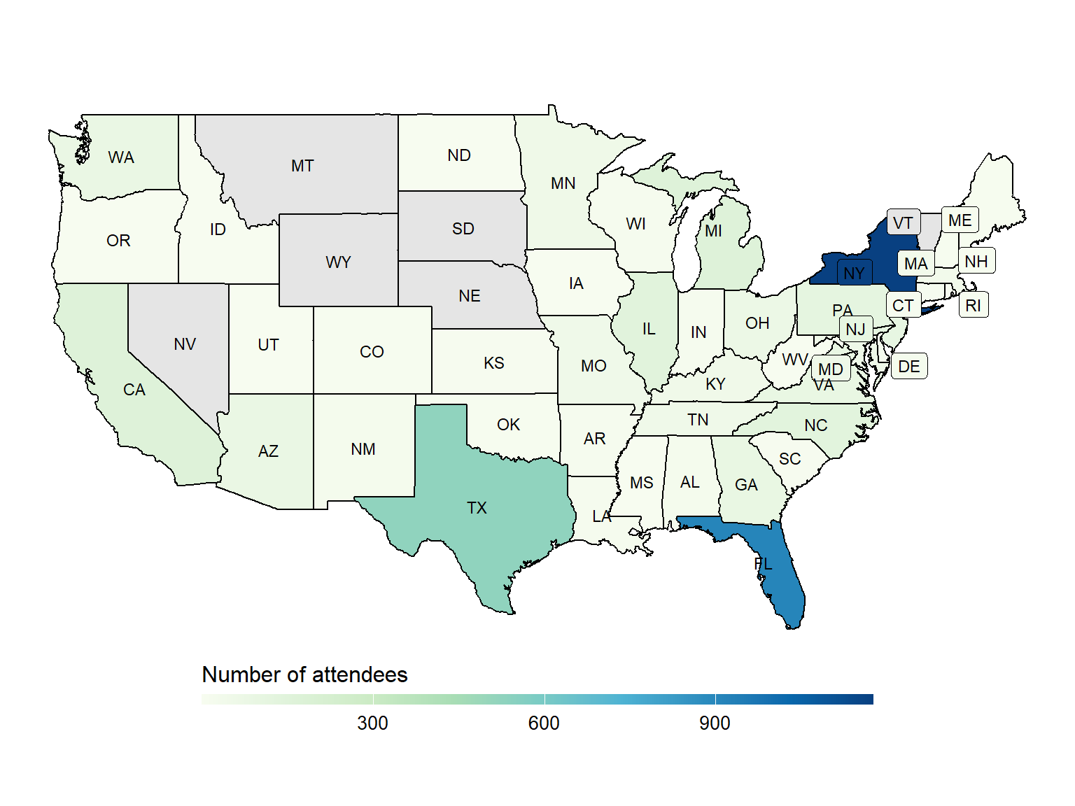
Participation, section design, rating distributions, and standing patterns from the 2025 SuperNationals VIII chess tournament in Orlando.
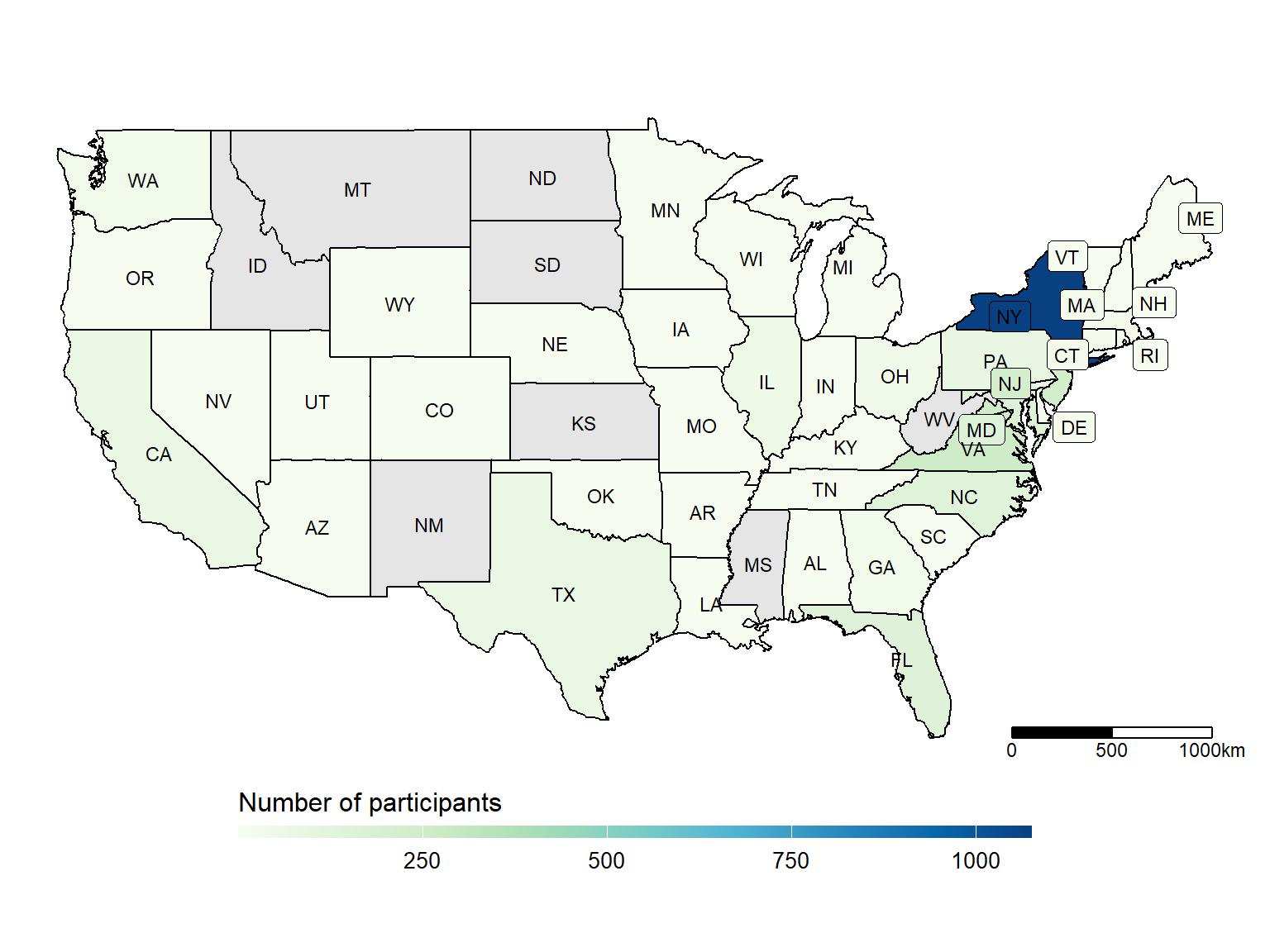
A look at participation, rating distributions, and the relationship between rating and final standing at the 2024 National K-12 Grades Championship.
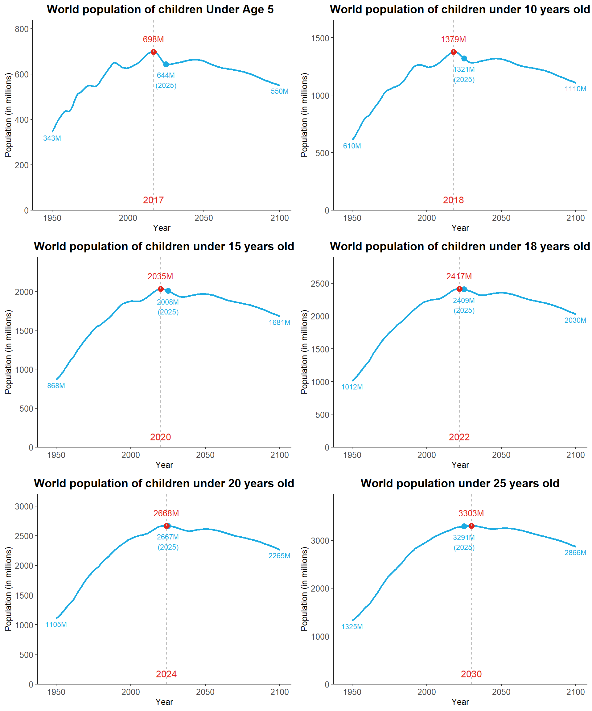
A compact reference for global age-group population totals from the UN World Population Prospects 2024 mid-year estimates.
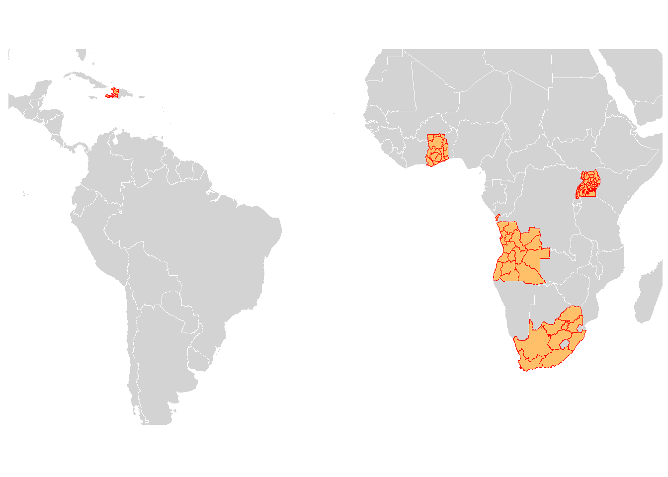
How to plot administrative areas from several countries in R, and how to avoid stray connecting lines caused by non-unique polygon group IDs.
A concise legacy R Markdown workflow for publishing small GitHub Pages sites, now preserved with a Quarto-era maintenance note.
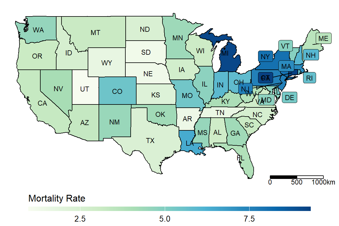
R examples for mapping COVID-19 mortality and incidence rates across US states and Chinese provinces, with a comparison to lung cancer maps.
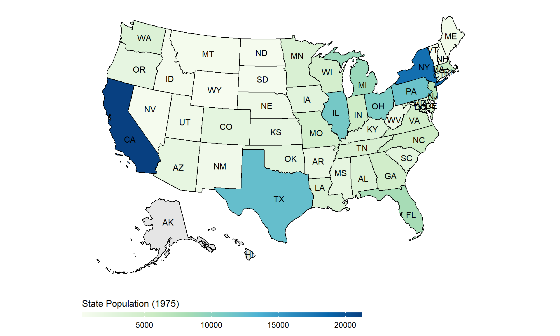
R examples for drawing US state and China province heatmaps with ggplot2, usmap, shapefiles, labels, scale bars, and leaflet-based alternatives.
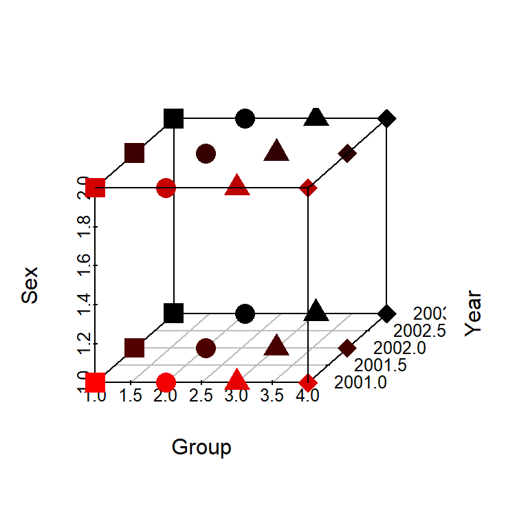
A compact R example for melting a 3D array into long-format data, modifying it, and rebuilding the array in the correct dimension order.
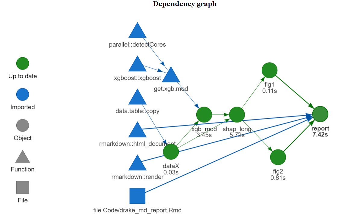
A legacy R workflow note showing how drake can cache calculations and speed up R Markdown report rendering, with a note on modern targets workflows.
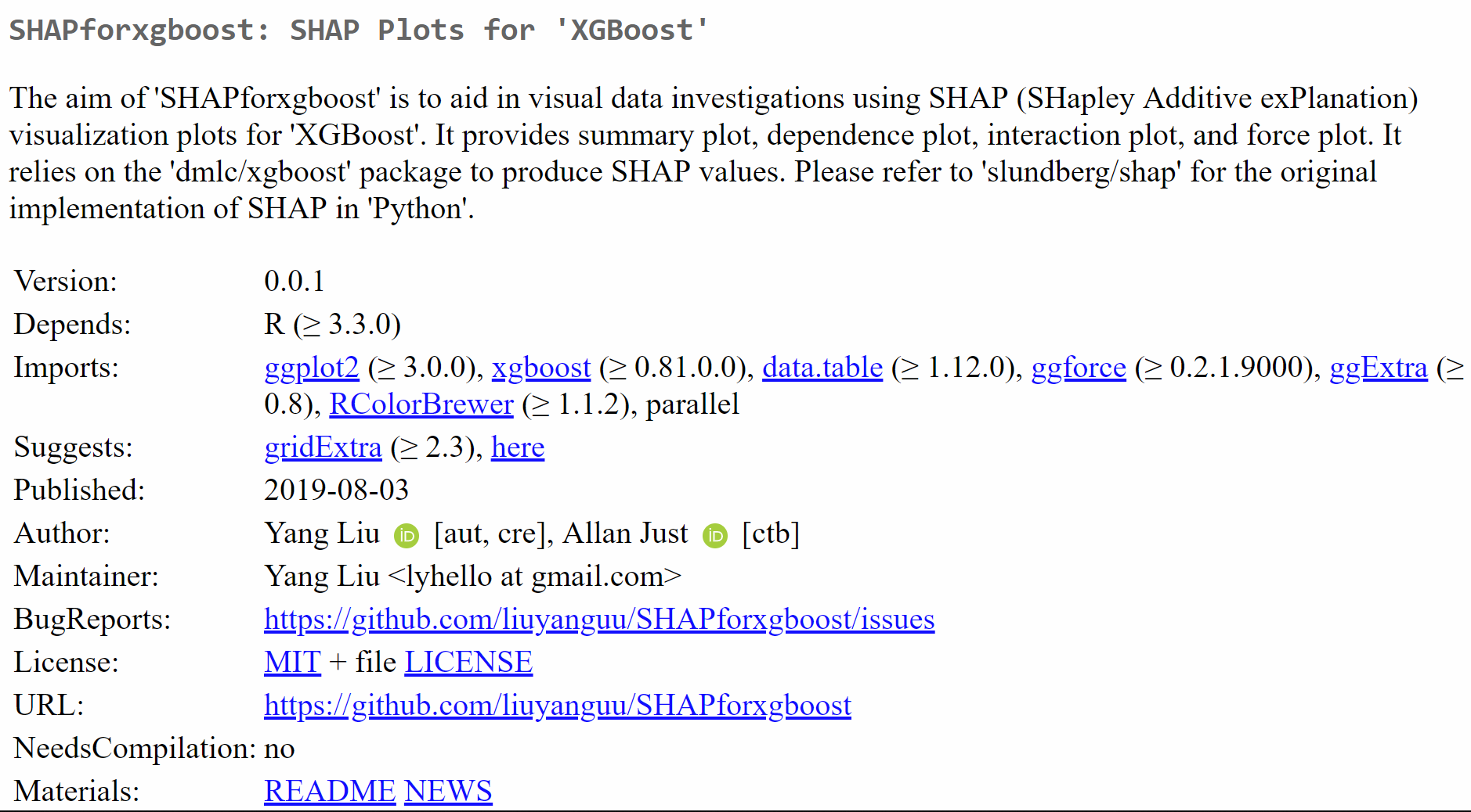
Practical notes from preparing the SHAPforxgboost R package for CRAN, including DESCRIPTION, NAMESPACE, documentation, checks, and reviewer feedback.
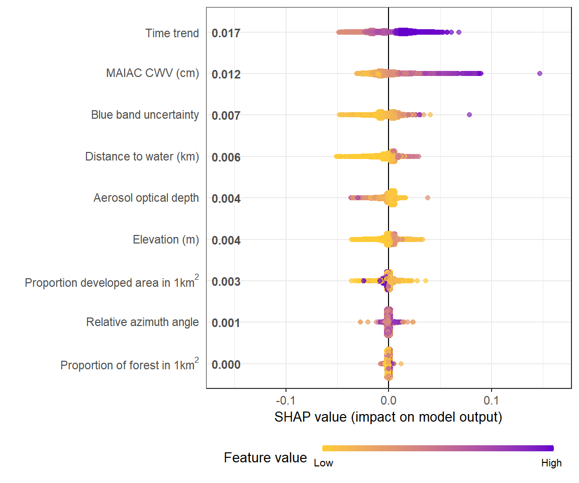
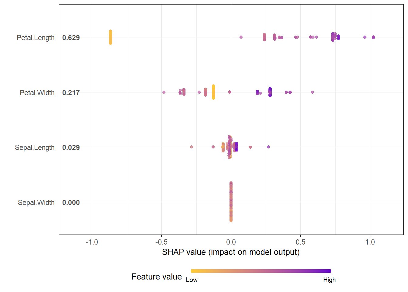
A vignette-style guide to the SHAPforxgboost R package, covering SHAP values, global importance, dependence plots, interaction effects, and force plots.
A short R note on embedding a hosted Shiny app inside a static blog page using an iframe or knitr helper.
A small R experiment that illustrates how shrinkage and DART dropout change the behavior of XGBoost trees on a simple toy dataset.
The original R post on SHAP visualizations for XGBoost, now linked to the later SHAPforxgboost package vignette.
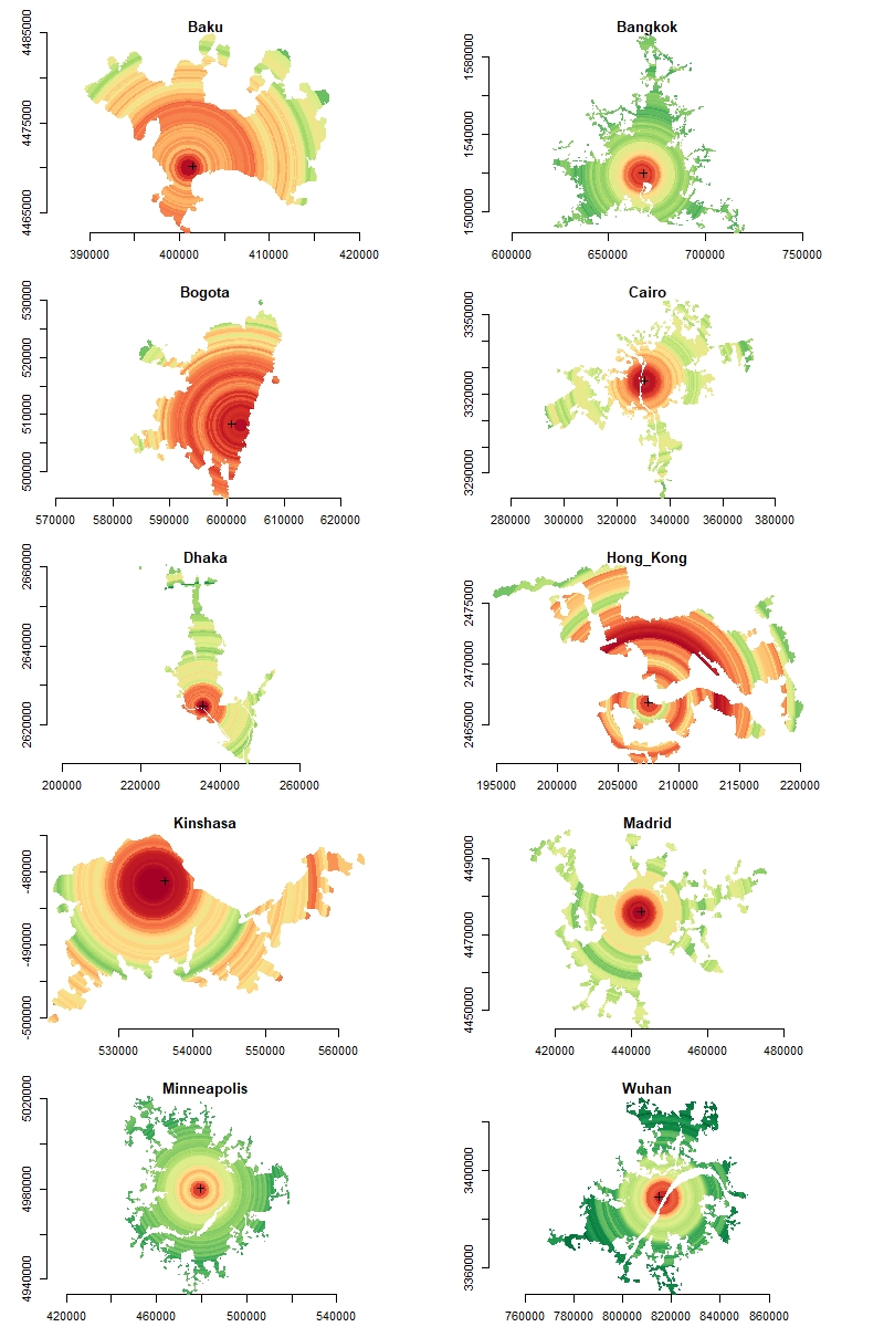
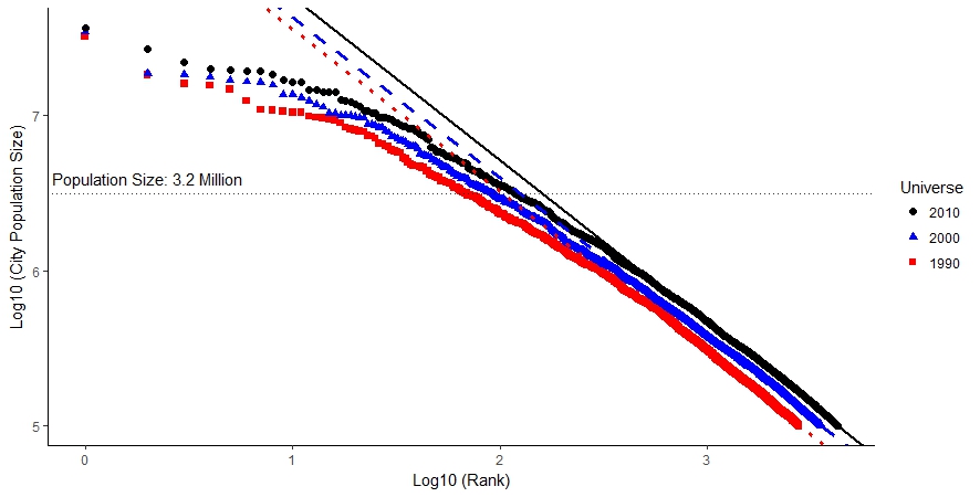
An R spatial workflow for turning raster layers into equal-area rings, calculating urban saturation, and plotting city comparisons on a shared scale.
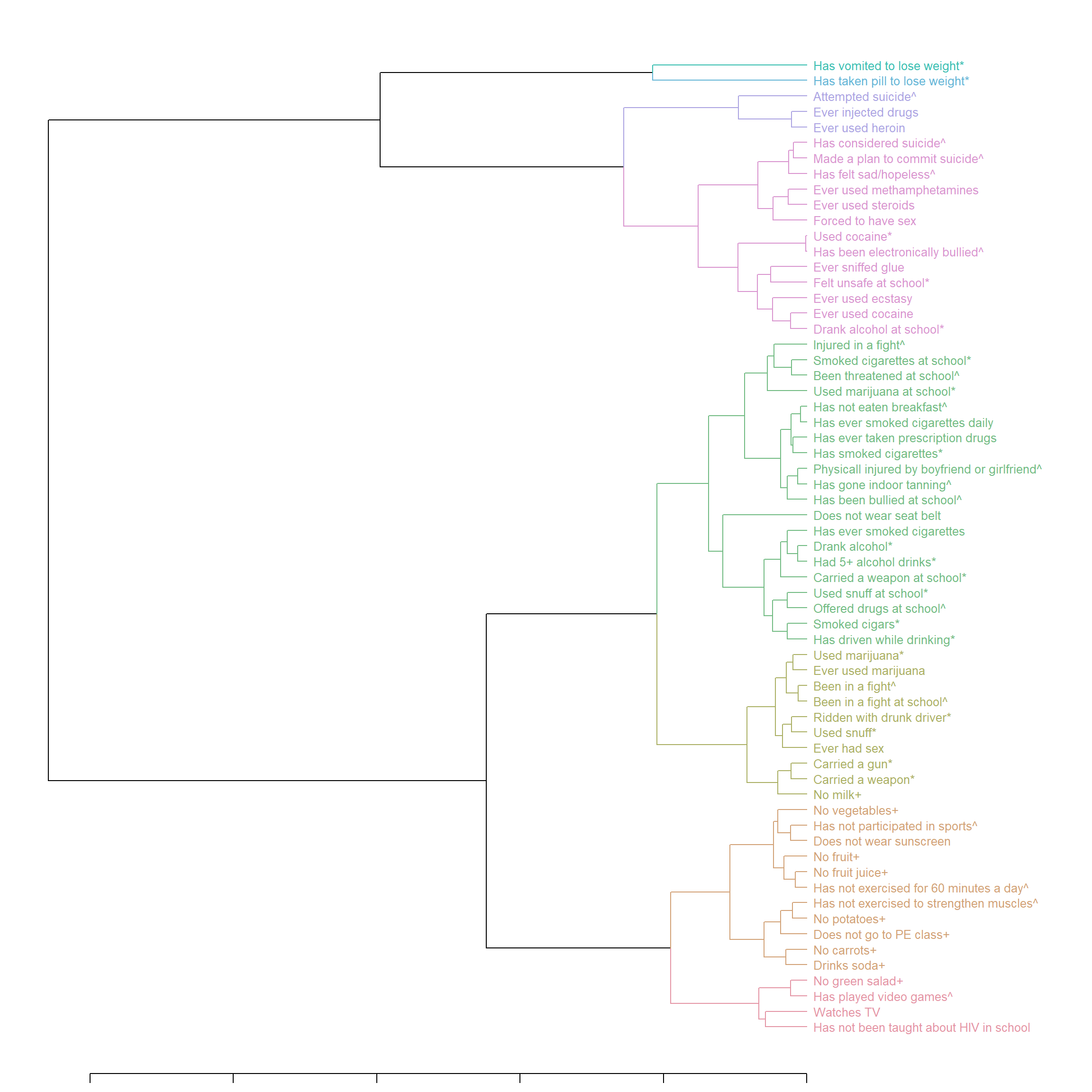
An R visualization example that builds a clustered heatmap with colorful dendrogram branches and labels using gplots, dendextend, and colorspace.
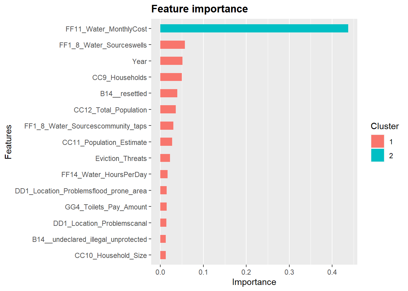
A hands-on R comparison of XGBoost, gradient boosting, random forest, lasso, and best subset regression on a slum-settlement modeling example.
A historical catalog of posts from my earlier Blogger site, with links to older work on statistics, data visualization, R programming, and urban research.