US and China Admin1 COVID-19 mortality and incidence rate
Data Visualization
R examples for mapping COVID-19 mortality and incidence rates across US states and Chinese provinces, with a comparison to lung cancer maps.
This post builds on my earlier US state and China province heatmap examples. Here I wrap the mapping code into a reusable function and apply it to COVID-19 data from the JHU CSSE GitHub repository. The function can take a given dataset and plot a designated variable.
The original code is hosted in my GitHub repo.
US
# major function, can download from GitHub repo Blogdown/hugo-xmag/Code
source(here::here("Code/COVID_make_map.R"))

# US
dt_JUH_US <- get.JHU.us.state()

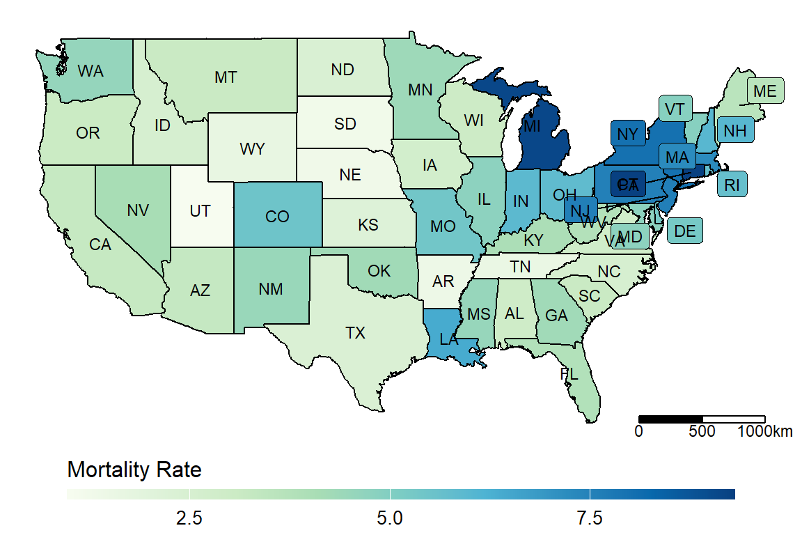
make_heatmap(data = dt_JUH_US,
            geo_data = get_state_name(),
            state_var = "Province_State", fill_var = "Mortality_Rate", label_var = "abb")
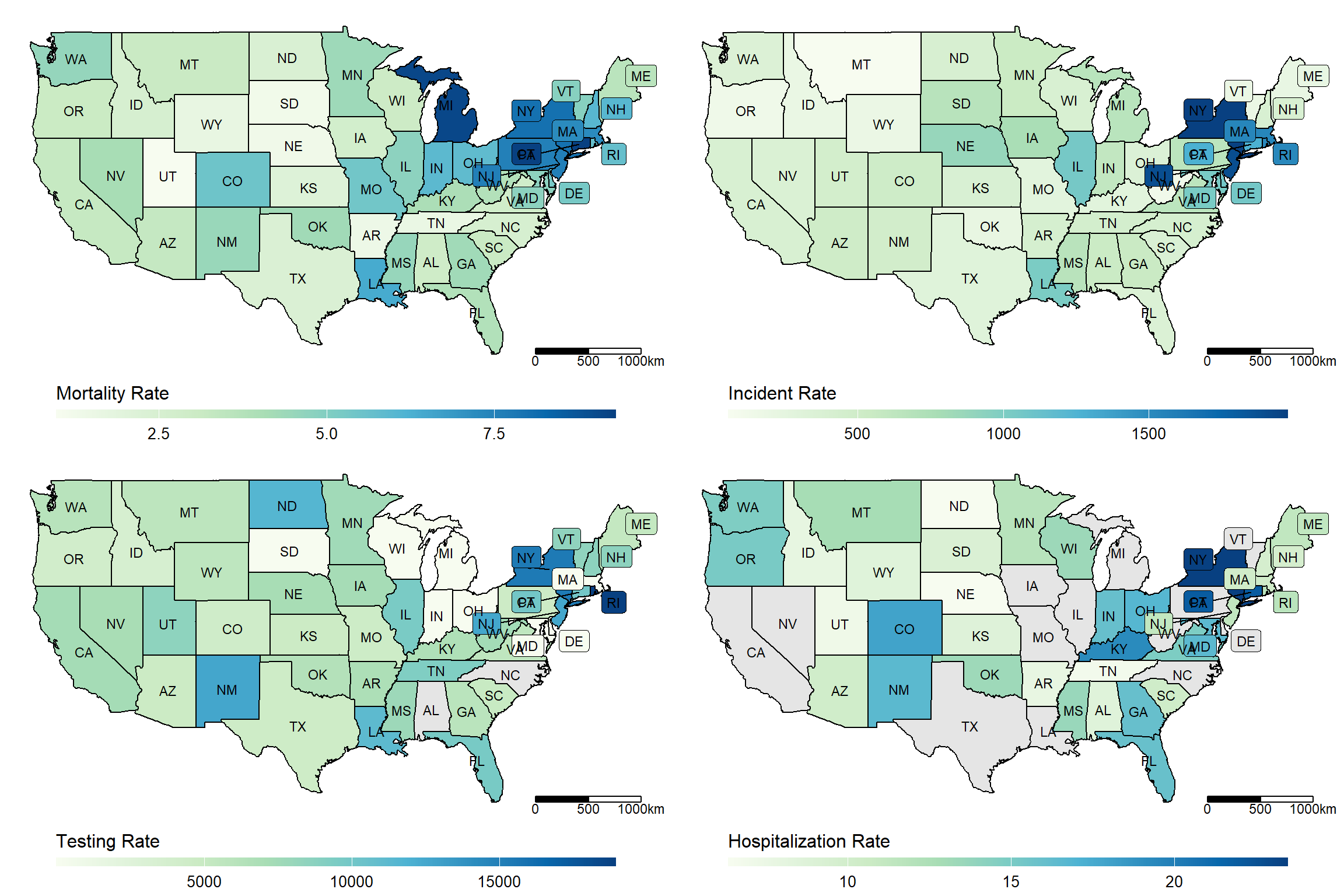
us_maps <- lapply(c("Mortality_Rate", "Incident_Rate",  "Testing_Rate", "Hospitalization_Rate"),
                  make_heatmap,
                  data = dt_JUH_US,
                  geo_data = get_state_name(),
                  state_var = "Province_State", label_var = "abb")
plot_grid <- gridExtra::grid.arrange(grobs = (us_maps), ncol = 2)
Compared to
China
# China (incl. Taiwan)
dt_JUH <- get.JHU.daily()
dt_CN <- dt_JUH[Country_Region %in% c("China", "Taiwan*"),]
dt_CN[Country_Region=="Taiwan*", Province_State:= "Taiwan"]
dt_china_map <- readRDS(here::here("../Data/dt_china.rds"))
setnames(dt_china_map, "province_EN", "state")
unique(dt_CN$Province_State[!dt_CN$Province_State%in%dt_china_map$state])
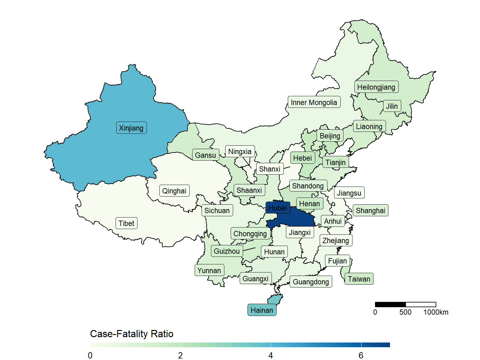
## [1] "Hong Kong" "Macau" "Unknown"make_heatmap(data = dt_CN,
geo_data = dt_china_map,
state_var = "Province_State", fill_var = "Case-Fatality_Ratio")
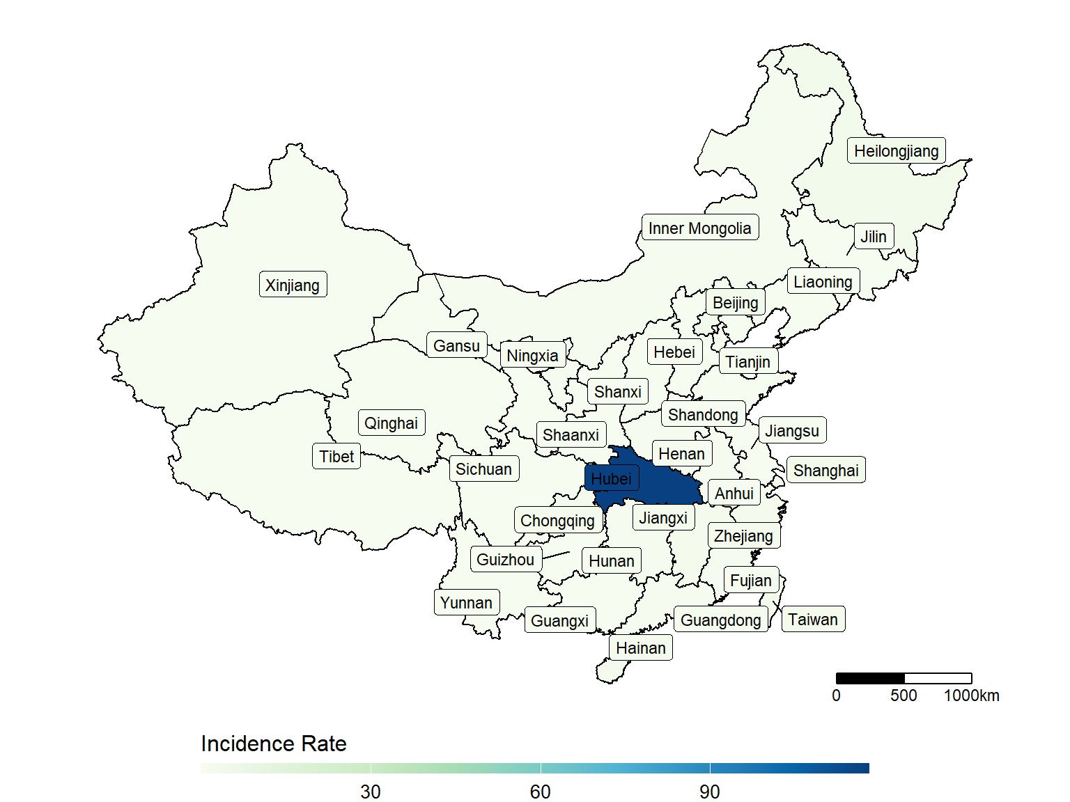
make_heatmap(data = dt_CN,
             geo_data = dt_china_map,
             state_var = "Province_State", fill_var = "Incidence_Rate")
Compared to lung cancer mortality
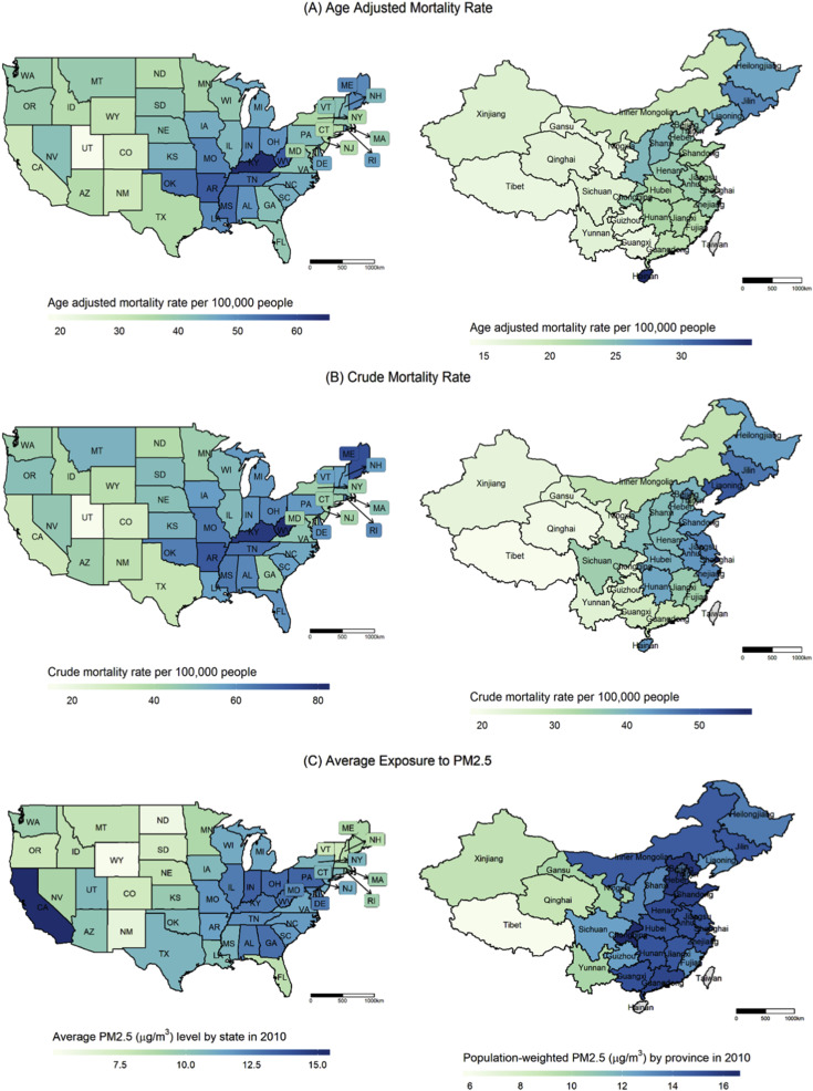
Age-adjusted mortality rate (A) and crude mortality rate (B) in the US by state (in 2015) and in China by province (in 2008), from my paper “Epidemiology of lung cancer and lung cancer screening programs in China and the United States”, Cancer Letters 2020-01