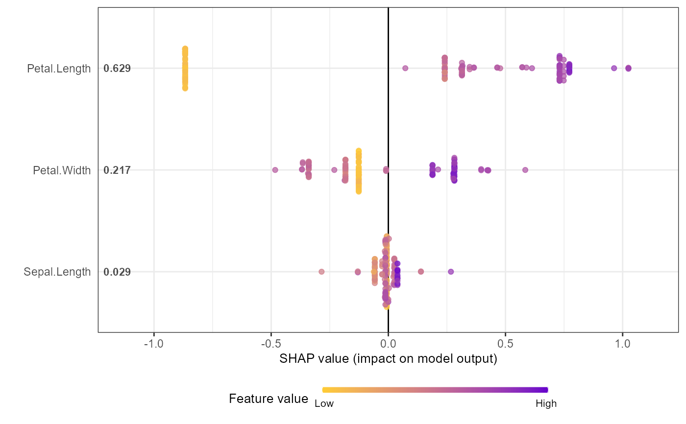
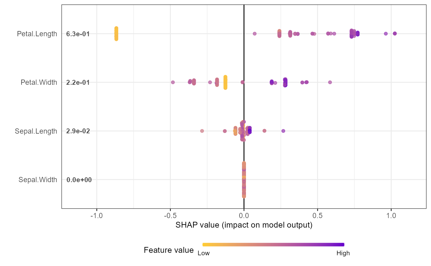
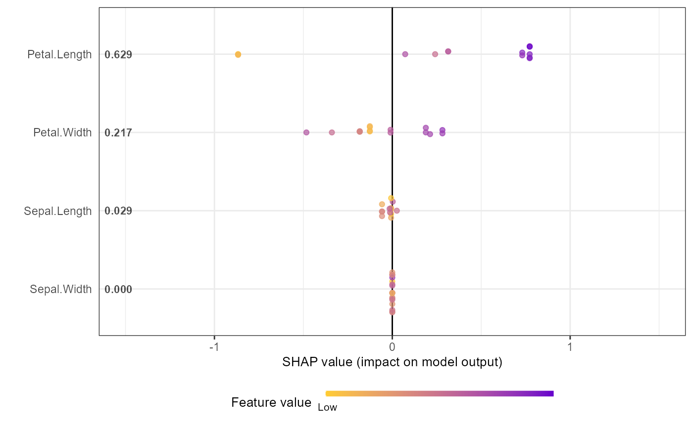
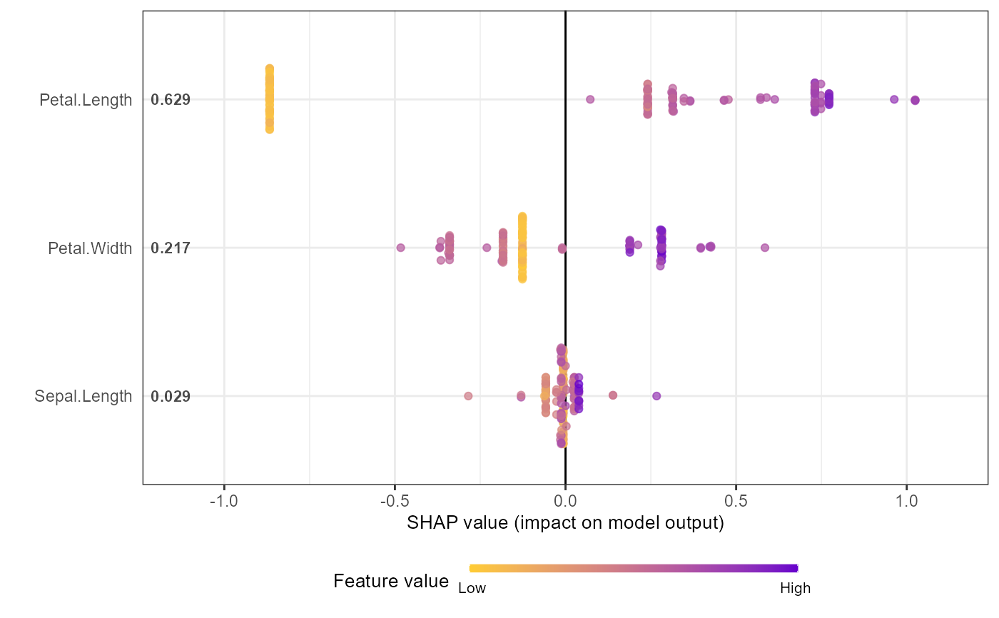
Creates a beeswarm/sina plot or bar chart showing feature importance.
The sina plot shows SHAP value distributions for each feature, colored by
feature values. For a simpler workflow, use shap.plot.summary.wrap1
(directly from model) or shap.plot.summary.wrap2 (from SHAP matrix).
Usage
shap.plot.summary(
  data_long,
  x_bound = NULL,
  dilute = FALSE,
  scientific = FALSE,
  my_format = NULL,
  min_color_bound = "#FFCC33",
  max_color_bound = "#6600CC",
  kind = c("sina", "bar")
)
Arguments
- data_long
a long format data of SHAP values from
shap.prep- x_bound
use to set horizontal axis limit in the plot
- dilute
being numeric or logical (TRUE/FALSE), it aims to help make the test plot for large amount of data faster. If dilute = 5 will plot 1/5 of the data. If dilute = TRUE or a number, will plot at most half points per feature, so the plotting won't be too slow. If you put dilute too high, at least 10 points per feature would be kept. If the dataset is too small after dilution, will just plot all the data
- scientific
show the mean|SHAP| in scientific format. If TRUE, label format is 0.0E-0, default to FALSE, and the format will be 0.000
- my_format
supply your own number format if you really want
- min_color_bound
min color hex code for colormap. Color gradient is scaled between min_color_bound and max_color_bound. Default is "#FFCC33".
- max_color_bound
max color hex code for colormap. Color gradient is scaled between min_color_bound and max_color_bound. Default is "#6600CC".
- kind
By default, a "sina" plot is shown. As an alternative, set
kind = "bar"to visualize mean absolute SHAP values as a barplot. Its color is controlled bymax_color_bound. Other arguments are ignored for this kind of plot.
Details
To customize feature labels, define new_labels in the global environment
as a named list (see labels_within_package for examples).
Examples
# Example: Basic workflow for SHAP summary plot
# Note: For xgboost 3.x, use xgb.DMatrix + xgb.train, and convert factor labels to numeric
data("iris")
X1 = as.matrix(iris[,1:4])
y1 = as.numeric(iris[[5]]) - 1 # Convert factor to numeric
dtrain = xgboost::xgb.DMatrix(data = X1, label = y1)
params = list(learning_rate = 1, min_split_loss = 0, reg_lambda = 0,
objective = 'reg:squarederror', nthread = 1)
mod1 = xgboost::xgb.train(params = params, data = dtrain,
nrounds = 1, verbose = 0)
# Get SHAP values and feature importance
shap_values <- shap.values(xgb_model = mod1, X_train = X1)
shap_values$mean_shap_score # Ranked features by mean|SHAP|
#> Petal.Length Petal.Width Sepal.Length Sepal.Width
#> 0.6307042 0.2135736 0.0300757 0.0000000
shap_values_iris <- shap_values$shap_score
# Prepare long-format data for plotting
shap_long_iris <- shap.prep(xgb_model = mod1, X_train = X1)
# Alternative: use pre-computed SHAP values
shap_long_iris <- shap.prep(shap_contrib = shap_values_iris, X_train = X1)
# SHAP summary plot
shap.plot.summary(shap_long_iris, scientific = TRUE)
 shap.plot.summary(shap_long_iris, x_bound = 1.5, dilute = 10)
 # Alternative options:
# Option 1: directly from xgboost model
shap.plot.summary.wrap1(mod1, X = as.matrix(iris[,1:4]), top_n = 3)
# Alternative options:
# Option 1: directly from xgboost model
shap.plot.summary.wrap1(mod1, X = as.matrix(iris[,1:4]), top_n = 3)
 # Option 2: from pre-computed SHAP values (useful for cross-validation)
shap.plot.summary.wrap2(shap_score = shap_values_iris, X = X1, top_n = 3)
# Option 2: from pre-computed SHAP values (useful for cross-validation)
shap.plot.summary.wrap2(shap_score = shap_values_iris, X = X1, top_n = 3)